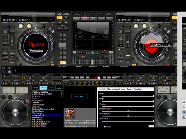
Resized and Modified A high Resolution Skin To be 1280x800 compatible.had resized it months ago but theres a problem.the plugins control panels (Like the Firetext,Text2D and others) wont resize properly and end up with a right side and bottom gone!! its there a way in the Xml other than "Browser size" to resize them panels? since I've ended up doing a face lift on this (very nicely so far) in order to get back some Browser space but still not enough to make a difference in the plugins layouts IF i just change Browser size in the Xml. BTW folks Im talking about Zanard's X-12!! (when i take on a project,I go for Broke!...Lol ..!! Ohh Yeahh!! ps tried to contact Zanard but he must be climbing them swiss mountains ! he,he
Posted Tue 20 Jul 10 @ 10:41 pm
So what is your secret here???
Posted Wed 21 Jul 10 @ 3:43 am
There's a joke in there somewhere..Right? just give me a second to figured it out..humm..(he,he) Anyways ..people that dont carry a giant screen with them all the time would like to play with this skin also.and thats no secret!! ;-)
Posted Wed 21 Jul 10 @ 10:14 am
It's just a Resize tool, not a Rebuild Tool, so just pick up the right skin for you, resize it, and maybe you will have to make some modifications on your own.
Posted Wed 21 Jul 10 @ 12:57 pm
@DjDad..youre overlooking one thing (has'nt this happenned to me before?) Ive been Resizing ALL the skins in this site (since i only have a 1280 x 800 res.So... "been there,done that!" as we say here in the west.I've resized YOUR skins,everybodies !! Beta tested Hueys and touchDan's.then theres the Plugins...Now come on!! How do I change the size OF the plugins control panels that show In the browser area? Because Zanards X-12 skin extends downward into the browser!! And Jeremk warned me about this when i first started resizing (a year ago?) which is why he comments ,I think..he,he...But Is it in the Virtual Dj's SDK? not the Xml? Thanks for any help you can offer.will post a picture of my New layout as soon as I know it is worthy of doing so. So whats up?...he,he
Posted Wed 21 Jul 10 @ 10:51 pm
You can't change the size of the plugin 'view' within the browser. I believe it is an issue for the plugin developer.
However if i am honest with you i don't think many of them will change things as in the most part what is currently in place is acceptable for most users.
I am 100% sure it can't be done in the skin xml - and 80% sure it isn't in VDJ itself.
However if i am honest with you i don't think many of them will change things as in the most part what is currently in place is acceptable for most users.
I am 100% sure it can't be done in the skin xml - and 80% sure it isn't in VDJ itself.
Posted Thu 22 Jul 10 @ 7:43 am
Thanks Dan!! kinda what i figured. one can allways change skin to access the browser's normal layout but it would be nice to use it just like that....and thought of a bigger face lift by gettin rid of the bottom mixer panels alltogether but thats a lot of stuff to have to resize and cram back at the top!! kind of funny really.but thats the whole "swing" of this skin.humm I wonder then ..how much bigger the browser has to be in order to see those plugins layouts correctly? 70%?,80%? or its have to be closer to a 100%? I ll text it.
Posted Thu 22 Jul 10 @ 8:56 am
And....I thought of that...plugin's developer for the most part would be scott! poor scott! its up to his neck in project requests!! ha,ha! what you say bro? can you take on this task?..
Posted Thu 22 Jul 10 @ 9:17 am
The new version of ScrollText resizes automatically. Don't ask when it will be available!
Posted Thu 22 Jul 10 @ 2:16 pm
For a correct display, the browser needs to be at least 800 pixels in width and 265 pixels in height.
Below these width/height values, you will start experiencing some visual problems.
Below these width/height values, you will start experiencing some visual problems.
Posted Thu 22 Jul 10 @ 3:47 pm
i guess you have to choose a skin with larger browser then. I mean Zanard's X-12 skin was actually designed for large monitors, with high resolutions. He also created a 1440X900 version but that's the smallest resolution to use this skin in my opinion, i mean so many things in smaller view would be difficult to be showed correctly.
Posted Thu 22 Jul 10 @ 5:15 pm
Thanks guys!! I figured it would be a challenge since I was forwarned...kind of a drag,having to switch skins in the middle of the mix just to get access to the firetext controls and such ,then switch back to the X-12. humm I did have another fix in mind.what if we had the bottom mixer in a 2nd LAYER that would "collapse"the bottom platter panels (and all xml mapings) therefore giving full access to the browser area? at a push of a button? in other words, Layer1 with the platters,and Layer 2 without. would be a first!! (and a lot of work but..) see any restrictions in doing this? I mean i could go ahead and make a 2nd skin version Without the panels and with full Browser space,and select it under "configurations/skins" and switch that way...I know...sort of a "Alien" method to you guys but Hey!! ...if it works..
Posted Thu 22 Jul 10 @ 9:42 pm
Jeremk, Pure genious !! didnt think of what youre trying to tell me. I temporalary changed the size to your specs and compared the overlap into the panels and if i move some things around it can work. back to the drawing board!! THANKS!!
Posted Thu 22 Jul 10 @ 11:41 pm
Ha,ha spoke too soon! just looked at that bitmap and i need more space on the bottom of that mixer to add 2 panels.the other graphics are there.what do i do?
Posted Fri 23 Jul 10 @ 1:16 am
thetracker510 wrote :
.what do i do?
QUIT!! Hahaaa!! The cards are stacked against you on this 1 my friend..................everytime you move 1 thing you have to move something else, its a never ending battle and all that work so you can use 1 plugin??? OCD, lmfao!!
Peace Out Homie,
Huey
Posted Fri 23 Jul 10 @ 1:36 am
ha! nope! Im almost done.Cut out more controllers off the bottom,resized them,moved them to the top,and im looking at that firetext plugin's buttons for the layouts just like we need it!.had to move the right pltter further right so now remap that and thats it. the logo thing its minor in my book (it not resizing so it overlaps)but the main purpose was to gain broser space.Dont under extimate!! ha,ha! thanks jeremk and everybody..for the hints to send me in the right direction!
Posted Fri 23 Jul 10 @ 6:59 pm
SO...I layd it out according to Jeremk's specs and now i can see the firetext's Load button for templates which was my main concerrn.but some other similar plugins control buttons are chopped off WHEN they are furthur to the bottom.thats because i need to make space in the bitmap layout to add a longer browser and if this theory its correct i need to know.didnt want to move the images below that mixer (litted buttons,etc) cause i have to re-map those as well,and wanted to see if this would work first.again will post an image as soon as i do some clean up of some messy mappings...Lol...
Posted Fri 23 Jul 10 @ 10:07 pm
Boy!!!! Im having fun with this baby!!! theres just a few minor cosmetic stuff but.Kept ALL of zanards tricks in this skin Plus gain Browser space !!!! Hello? Are you there?
Posted Sat 24 Jul 10 @ 4:24 am
Allright...SCREEN...PLEASE!
Posted Sat 24 Jul 10 @ 7:39 am
trying to load a image..hehe (why is this so difficult?)  ha! there we go...
 ha! there we go...
Posted Sat 24 Jul 10 @ 8:24 am


