Well i said i was working on something.......and i am.
This is possibly the biggest and most technical skin i have ever attempted. It makes me admire the work of Format and the graphical work of Zanard even more (to name but a few - there are many many excellent skinners).
Its prooving extreme hard work and VERY time consuming. It will take a while before i am at Beta but i thought i would share 'whats going on' with you guys here.
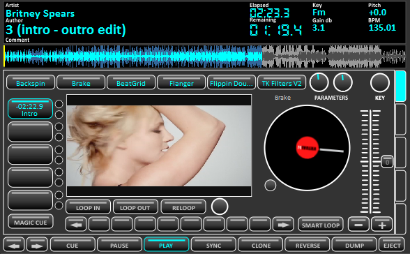
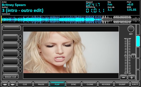
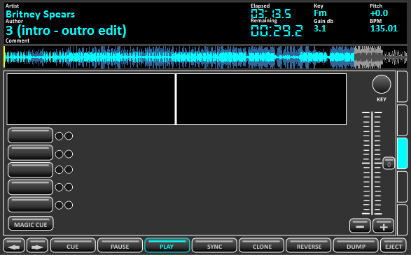
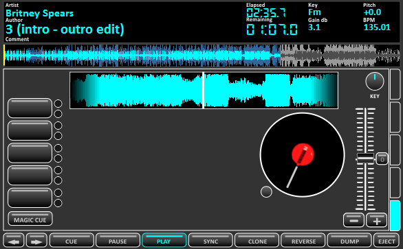
Firstly each deck has five pannels: Default View, Super Video, ScratchWave, Super Platter and ScratchWave Platter.
Also includes mulitple platter options (not sure where i got that idea from Beatbreaker and Zanard ;) )
The mixer has 6 pannels: Default with Video, Simple Audio, Advanced Audio, Scratch with Video, Scratch with Timecode and Automix (the automix pannel is not selectable and is only 'on' when automix is active).
There are 5 RhythmWave views: Default, Default no CBG, Horizonal Split, Vertical Split and OFF
Here's a couple of Screenshots to tease you :)
Default View:
Super Video View:
ScratchWave:
This is possibly the biggest and most technical skin i have ever attempted. It makes me admire the work of Format and the graphical work of Zanard even more (to name but a few - there are many many excellent skinners).
Its prooving extreme hard work and VERY time consuming. It will take a while before i am at Beta but i thought i would share 'whats going on' with you guys here.
Firstly each deck has five pannels: Default View, Super Video, ScratchWave, Super Platter and ScratchWave Platter.
Also includes mulitple platter options (not sure where i got that idea from Beatbreaker and Zanard ;) )
The mixer has 6 pannels: Default with Video, Simple Audio, Advanced Audio, Scratch with Video, Scratch with Timecode and Automix (the automix pannel is not selectable and is only 'on' when automix is active).
There are 5 RhythmWave views: Default, Default no CBG, Horizonal Split, Vertical Split and OFF
Here's a couple of Screenshots to tease you :)
Default View:

Super Video View:

ScratchWave:

Posted Mon 14 Jun 10 @ 8:35 am
How do you guys do it..............Dam that looks good!! Cant wait to see this bad boy when it s done. Plus thats a hot video too, lol!!
Huey
Huey
Posted Mon 14 Jun 10 @ 11:31 am
Nice work Dan!
Posted Mon 14 Jun 10 @ 12:16 pm
Excellent! Could be the new standard... lokks haed to beat metmort
Posted Mon 14 Jun 10 @ 1:55 pm
super video looks cool for either side, then can we have a super bug off big one in the middle to help my vanity Dan, bloody hard reading text messages in the centre panel with my crappy failing sight... lol.
Posted Mon 14 Jun 10 @ 2:39 pm
Love the colour scheme, looks excellent :)
Keith
Keith
Posted Mon 14 Jun 10 @ 3:11 pm
The two missing Deck pannels i didnt show earlier.
Super Platter
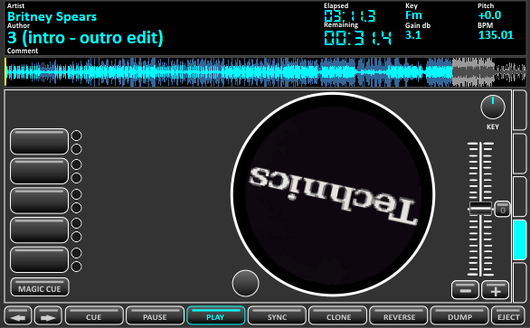
ScratchWave Platter
Default Rhythm and Rhythm H-Split
(Picture also show Rhythm Selector Buttons :) )


Available Slipmats





Super Platter

ScratchWave Platter

Default Rhythm and Rhythm H-Split
(Picture also show Rhythm Selector Buttons :) )


Available Slipmats


Posted Mon 14 Jun 10 @ 5:09 pm
wow im amazed =)
nice work dan
nice work dan
Posted Mon 14 Jun 10 @ 9:15 pm
Now we're talkin' dude :-)
Posted Mon 14 Jun 10 @ 9:35 pm
Can't Touch Dan!, boom,boom,boom,boom,....boom,boom,.. boom,boom.....Cant touch Dan! (ala Hammer).....he,he!
Posted Tue 15 Jun 10 @ 10:51 pm
Update now showing deafult mixer view in progress :-)
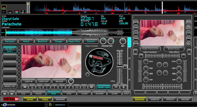
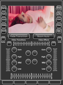


Posted Thu 17 Jun 10 @ 4:30 pm
Dan! do'nt Stop on a 6th mat (bad luck number!) add a 7th mat, a Hercules RMX logo maybe? just a thought..looks GREAT!
Posted Thu 17 Jun 10 @ 10:41 pm
LOVE the fact that you're giving us a video preview AND a platter on each side and that we don't have to choose between one or the other!
Question. Can you make the clone button a DOUBLE CLICK button? I ran into some issues at a gig recently where I got a little trigger happy and clicked when I didn't mean to click and somehow ended up with SILENCE because the spinning player A cloned player B that only had a song cued up but paused! Anyway a double would prevent that accident!
Also you're not taking the scratch wave forms away from us under the center video preview are you? I love those!
Posted Mon 21 Jun 10 @ 9:02 pm
Oooooh one more fro the wishlist! A button to turn ON and OFF the timecode feature for each deck!
MixLab 3.1 does this if you need a point of reference.
MixLab 3.1 does this if you need a point of reference.
Posted Mon 21 Jun 10 @ 9:05 pm
Dan...Are we there yet?...getting nervous...LoL...
Posted Tue 29 Jun 10 @ 7:50 pm
O.K. Break out the pills...
Posted Tue 06 Jul 10 @ 10:43 pm
Still around guys. Just struggling for time to work on this one.
Got a secret project on the go.......... ;-)
Got a secret project on the go.......... ;-)
Posted Mon 12 Jul 10 @ 2:38 am
Hey! looking for them Lost Blueprints for a while there buddy,he,he...LoL...
Posted Mon 12 Jul 10 @ 7:06 pm
Hey guys,
Thought i\'d let you all know i am still working on this skin. It\'s a monster and proving VERY time consuming, made even more difficult by additional work commitments over the last and next couple of months.
I do have a week off in a couple of weeks so hope to get a lot done then - hopefully.
Anyways i\'ve added proper VU meters and a beat graphic today to deck 1 - nothing else has changed much, other than slightly smaller pannel select buttons (so i could fit the VU where i wanted it)
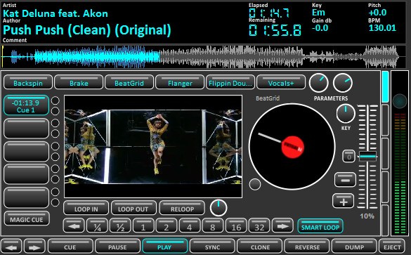
Good to see some new skinners coming through too - thetracker and beatbreaker producing some excellent work. As always post comments and i hope the next update i have is something a little more exciting than a VU meter - LOL
:-)
Thought i\'d let you all know i am still working on this skin. It\'s a monster and proving VERY time consuming, made even more difficult by additional work commitments over the last and next couple of months.
I do have a week off in a couple of weeks so hope to get a lot done then - hopefully.
Anyways i\'ve added proper VU meters and a beat graphic today to deck 1 - nothing else has changed much, other than slightly smaller pannel select buttons (so i could fit the VU where i wanted it)

Good to see some new skinners coming through too - thetracker and beatbreaker producing some excellent work. As always post comments and i hope the next update i have is something a little more exciting than a VU meter - LOL
:-)
Posted Sun 25 Jul 10 @ 11:22 am
Dan that looks badass man!! Keep it up!
Huey
Huey
Posted Sun 25 Jul 10 @ 1:47 pm


