


") Dan (djtouchdan)
Dan (djtouchdan)
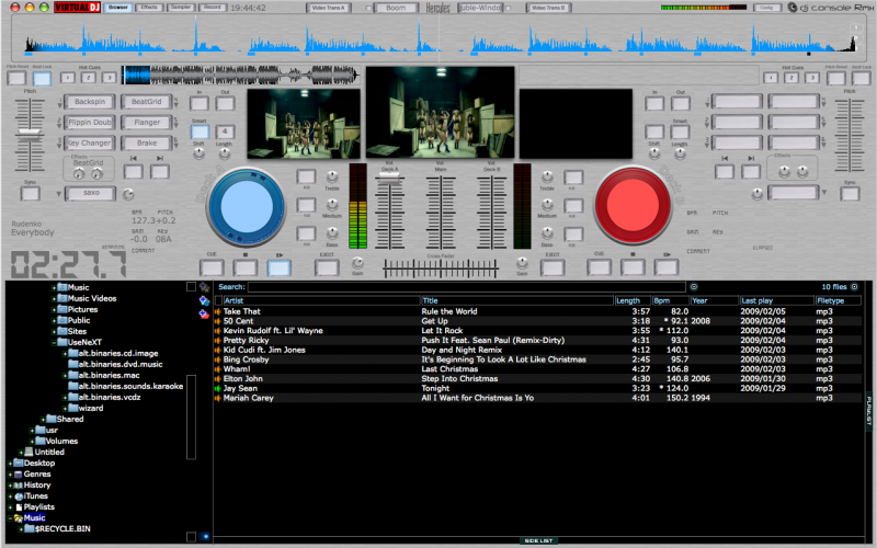
Please let me know your thoughts on this re-design of the Hercules RMX for Video Jockeys out there.
Please let me know your thought/comments/suggestions.
djtouchdan...
Please let me know your thought/comments/suggestions.
djtouchdan...
Posted Sat 07 Feb 09 @ 1:54 pm
 MCJULI
Cool !! I like it :)
Posted Sat 07 Feb 09 @ 1:56 pm
 jimmy b
MCJULI wrote :
Cool !! I like it :)
Me too,
but the text on the skin and track timer needs to be more darker or a different colour from them to stand out more mate.
Posted Sat 07 Feb 09 @ 2:04 pm
Dan (djtouchdan)
Will make it darker i think (probably black) - dont want to add any more colours.
Posted Sat 07 Feb 09 @ 2:59 pm
 tayla
tayla
are you psychic or what, anyway, like what you are doing, how about the track read outs in blue and red respectively or make the read outs both orange, will stand out and look ok when working.
Posted Sat 07 Feb 09 @ 3:30 pm
Dan (djtouchdan)tayla wrote :
are you psychic or what, anyway, like what you are doing, how about the track read outs in blue and red respectively or make the read outs both orange, will stand out and look ok when working.
Ok - have opted for the blue and red i think - looked at the orange and didnt like it in my opinion.
I am also trying to implement new browser icons too:
Karaoke:
Audio:
Please let me know your opinions.
Posted Sat 07 Feb 09 @ 3:54 pm
tayla
hey they look good(icons), will save a lot of posts from users needing a total contrast between the video and karaoke colours, any chance of darkening down the blue read outs just a tadge, look a bit light, don't know how the red looks,
like the new icons by the way, nice work...
like the new icons by the way, nice work...
Posted Sat 07 Feb 09 @ 4:20 pm
tayla
forgot to ask will this be in 1400 x 900 would be nice if possible. thanks
Posted Sat 07 Feb 09 @ 4:22 pm
tayla
just noticed, can you increase track information font ? maybe you have to move the bpm, pitch and other stuff over to the right a bit or drop it down so it's level with the time read out and then use all of that free space for track information... just a thought
Posted Sat 07 Feb 09 @ 4:28 pm
Dan (djtouchdan)tayla wrote :
hey they look good(icons), will save a lot of posts from users needing a total contrast between the video and karaoke colours, any chance of darkening down the blue read outs just a tadge, look a bit light, don't know how the red looks,
like the new icons by the way, nice work...
like the new icons by the way, nice work...
Will try and match it to the dark blue on the turntable i think??
tayla wrote :
forgot to ask will this be in 1400 x 900 would be nice if possible. thanks
It is being designed at 1280x800 at the moment but could do a 1440x900 version
tayla wrote :
just noticed, can you increase track information font ? maybe you have to move the bpm, pitch and other stuff over to the right a bit or drop it down so it's level with the time read out and then use all of that free space for track information... just a thought
Agreed - will re-work the track info
Posted Sat 07 Feb 09 @ 4:34 pm
tayla
looking good mate, me and a few others will be happy bunnys if you can get round to doing a 1400 x 900
Posted Sat 07 Feb 09 @ 4:41 pm
 JeremK
Wow! It looks great.
Posted Sat 07 Feb 09 @ 6:14 pm
tayla
might think about dropping the deck a + b decals... just another thought lol.
Posted Sat 07 Feb 09 @ 6:27 pm
Dan (djtouchdan)
Updated screenshot with some of the recommendations included:
This skin looks pretty good - not quite finished yet - need to fine tune the code and graphics.
If you have an opinion or comment then post away - i will consider all recommendations.
As i said in a previous post i have changed the default browser icons, i am not 100% happy with them - partly due to the fact you can't have a differnt icon for a \"played video\" or \"played audio\" - if you could if would be better. But as you can\'t (at the moment) the same icon will appear for anything that has been recently played.
Here are the new icons:

I'm skinned out for the day now - post your comments and i'll check them tomorrow.
djtouchdan....
This skin looks pretty good - not quite finished yet - need to fine tune the code and graphics.
If you have an opinion or comment then post away - i will consider all recommendations.
As i said in a previous post i have changed the default browser icons, i am not 100% happy with them - partly due to the fact you can't have a differnt icon for a \"played video\" or \"played audio\" - if you could if would be better. But as you can\'t (at the moment) the same icon will appear for anything that has been recently played.
Here are the new icons:
I'm skinned out for the day now - post your comments and i'll check them tomorrow.
djtouchdan....
Posted Sat 07 Feb 09 @ 7:03 pm
tayla
excellent work so far, amazed at how quick the work is coming through, what would your thoughts be on centralising the word "remaining" above the time countdown and having the same line up of buttons as the left deck starting from the gain knob ie the eject button to the right of the play/pause, anyway great stuff....
Posted Sat 07 Feb 09 @ 7:56 pm
tayla
can the audio/video crossfade be worked independently as well as together... now i'm off to kip, lol.
Posted Sat 07 Feb 09 @ 8:05 pm
jimmy bVery nice indeed, looking good.
I'm amazed how quick you work, I think we have a new Skin Master in the making!!!
Posted Sun 08 Feb 09 @ 3:43 am
Dan (djtouchdan)
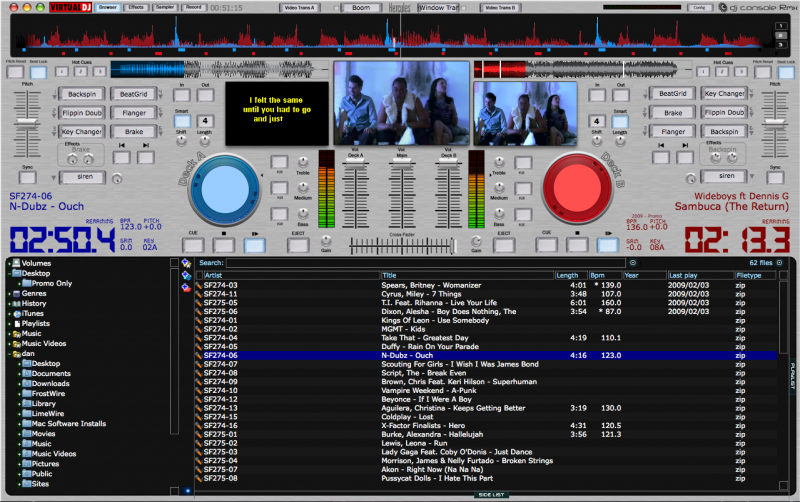
Nearing completiton on this skin now - just doing some more testing and bug fixing before i release it.
The ironic thing is i dont even own a Hercules RMX (yet!!) lol
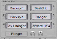
Some updated screenshots to tease you:
The overall skin design.

The effects bank designed to mimic that of the controller.
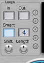
The updated loops effect unit.
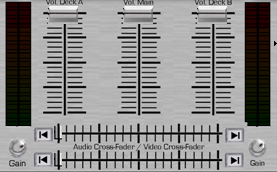
The Mixing desk which includes crossfaders for both audio and video with transition/jump buttons.
Hope everyone likes the look of it anyway.
djtouchdan
The ironic thing is i dont even own a Hercules RMX (yet!!) lol
Some updated screenshots to tease you:
The overall skin design.
The effects bank designed to mimic that of the controller.
The updated loops effect unit.
The Mixing desk which includes crossfaders for both audio and video with transition/jump buttons.
Hope everyone likes the look of it anyway.
djtouchdan
Posted Mon 09 Feb 09 @ 11:37 am
jimmy bTop class mate, top class
Is it going to be for PC or Mac or both?
Posted Mon 09 Feb 09 @ 12:19 pm
tayla
i'm well impressed, (the last time i said that was when jimmy had his legs waxed) and thank's for listening to the users... ooh i mean me. lol. never thought to ask do all the function buttons backlight to blue, do the audio/video crossfaders work jointly, got to ask someone needs to look dumb here... lol
excellent work dan.
excellent work dan.
Posted Mon 09 Feb 09 @ 2:22 pm