Count your pixels!
Are you sure that the centre graphic is symmetrical? That it's perfectly round with no lumps or bumps?
Remember that to be perfectly centred, the whole thing (width) needs to be an odd number - one dot in the centre with an even number of pixels either side.
Are you sure that the centre graphic is symmetrical? That it's perfectly round with no lumps or bumps?
Remember that to be perfectly centred, the whole thing (width) needs to be an odd number - one dot in the centre with an even number of pixels either side.
Posted Sun 18 Jan 15 @ 5:29 am
groovindj wrote :
Count your pixels!
Are you sure that the centre graphic is symmetrical? That it's perfectly round with no lumps or bumps?
Remember that to be perfectly centred, the whole thing (width) needs to be an odd number - one dot in the centre with an even number of pixels either side.
Are you sure that the centre graphic is symmetrical? That it's perfectly round with no lumps or bumps?
Remember that to be perfectly centred, the whole thing (width) needs to be an odd number - one dot in the centre with an even number of pixels either side.
Groovindj, you got me there man. I haven't the slightest but since you've made a super point I will have to perhaps redraw a new circle over the existing one. BTW - How do I change the resolution of a skin? I don't think it's necessary any longer because you can resize in VDJ 8 but what is the suggested resolution size to start any skin? I'm really getting the hang of this now and it's all because of everybody here helping me out. I really appreciate your advice from the experts themselves. Big thanks to you.
Posted Sun 18 Jan 15 @ 1:12 pm
Suggested resolution? In my opinion skins should still be made in various sizes so that the elements are proportioned correctly for the screen.
Yes it's nice that they do stretch (reasonably well) now, but making them all HD is not good when they're used on lower res screens (like laptop screens).
Text can end up too small to read, controls can be too small, browser icons (on the left edge) can disappear completely.
I've been converting old skins to work in VDJ 8 to use on my laptop, rather than use the HD ones.
Posted Sun 18 Jan 15 @ 1:36 pm
I thought the new way forward for V8 was that all skins were to be made for 1920x1080 and the software would auto scale them both up and down?
Posted Sun 18 Jan 15 @ 2:03 pm
The problem (in my opinion) is that when scaled down, every element within the skin becomes smaller.
When designed on/for HD screens, things (buttons, knobs, text etc.) are designed so they are a good size for use at that res. Run that on a smaller screen and it doesn't work so well. They're too small.
If you compare the HD VDJ 8 browser running at say 1280x800 to when it's running on the same screen in a proper 1280x800 res skin, the size of the individual elements (scroll bars, tabs etc.) is better on the lower (native res - not resized) skin.
When the skin itself is the correct res for the screen, VDJ 8 "scales up" the browser to fit the res. Running the HD skin, it doesn't do that, and the browser is compromised.
Posted Sun 18 Jan 15 @ 2:30 pm
Ah, OK
It's a while since I have had a laptop with 1280x800 or 1368x768 so I've not seen this happen in V8.
I really can't understand why low to midrange laptops still have such low res screens when both tablets and mpbile phones are generally far better .....
It's a while since I have had a laptop with 1280x800 or 1368x768 so I've not seen this happen in V8.
I really can't understand why low to midrange laptops still have such low res screens when both tablets and mpbile phones are generally far better .....
Posted Sun 18 Jan 15 @ 2:39 pm
groovindj wrote :
Suggested resolution? In my opinion skins should still be made in various sizes so that the elements are proportioned correctly for the screen.
Yes it's nice that they do stretch (reasonably well) now, but making them all HD is not good when they're used on lower res screens (like laptop screens).
Text can end up too small to read, controls can be too small, browser icons (on the left edge) can disappear completely.
I've been converting old skins to work in VDJ 8 to use on my laptop, rather than use the HD ones.
Yes it's nice that they do stretch (reasonably well) now, but making them all HD is not good when they're used on lower res screens (like laptop screens).
Text can end up too small to read, controls can be too small, browser icons (on the left edge) can disappear completely.
I've been converting old skins to work in VDJ 8 to use on my laptop, rather than use the HD ones.
Okay, so I re-drew the jog rotation (logo for the middle of the jog) and it still has a slight wobble. Everything is perfect in size and so I'm not sure why it has a slight wobble. I did notice that when I decrease the height and width, it seems to wobble less but nonetheless it still has a slight wobble. I'm not sure what else to do or what I'm doing wrong? I'm using Photoshop for all my work -- am I saving the redrawn work in an INTERLACED PNG or non-interlaced? What file format should I save the final skin in? Here is the code I'm tweaking around for the rotation in order to remove the wobble.
<visual type="rotation" source="get rotation">
<Tooltip></Tooltip>
<pos x="+0" y="+0"/>
<size width="216" height="216"/>
<on x="901" y="1761"/>
</visual>
Posted Sun 18 Jan 15 @ 2:51 pm
I wouldn't say they're low res. They're perfectly adequate for the screen size.
I'm typing this on a 1920x1080 res screen - but it's a 23" monitor. That same res on a smaller screen would be an issue.
For a 15.3" screen like my laptop has, 1280x800 is fine. Plus I imagine that VDJ & the CPU would be less stressed when using a skin that's native. It always used to be the case.
I'm typing this on a 1920x1080 res screen - but it's a 23" monitor. That same res on a smaller screen would be an issue.
For a 15.3" screen like my laptop has, 1280x800 is fine. Plus I imagine that VDJ & the CPU would be less stressed when using a skin that's native. It always used to be the case.
Posted Sun 18 Jan 15 @ 2:53 pm
My 13.3" laptop has 3200x1800 and that doesn't work at all. It's OK at 1920x1080 though!
Posted Sun 18 Jan 15 @ 3:13 pm
groovindj wrote :
Count your pixels!
Are you sure that the centre graphic is symmetrical? That it's perfectly round with no lumps or bumps?
Remember that to be perfectly centred, the whole thing (width) needs to be an odd number - one dot in the centre with an even number of pixels either side.
Are you sure that the centre graphic is symmetrical? That it's perfectly round with no lumps or bumps?
Remember that to be perfectly centred, the whole thing (width) needs to be an odd number - one dot in the centre with an even number of pixels either side.
GroovinDJ, found the issue my man! You were exactly right in the graphics being symmetrical. I just finished redrawing the jogwheel all over and its now perfect. So there was a slight issue with the symmetrics of the jogwheel. Best regards and thanks again for all your help and time.
Posted Sun 18 Jan 15 @ 3:18 pm
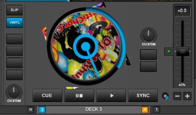
Any way I can fix this issue? The corners are still showing and I don't know how to make it disappear. I have to create a mask -- I've done it but for some reason it's still showing the corners when the cover rotates. =/

Posted Mon 19 Jan 15 @ 1:19 pm
I guess the mask needs to be bigger then.
If it's square (the width/height of the jog) then as the square cover spins behind it, the pointy bits are sticking out past the edges because the cover is "wider" diagonally.
If it's square (the width/height of the jog) then as the square cover spins behind it, the pointy bits are sticking out past the edges because the cover is "wider" diagonally.
Posted Mon 19 Jan 15 @ 1:42 pm
groovindj wrote :
I guess the mask needs to be bigger then.
If it's square (the width/height of the jog) then as the square cover spins behind it, the pointy bits are sticking out past the edges because the cover is "wider" diagonally.
If it's square (the width/height of the jog) then as the square cover spins behind it, the pointy bits are sticking out past the edges because the cover is "wider" diagonally.
Can I have a round mask? Wouldn't this fix the whole issue? Why do the cover have to be square? It only makes sense to make a round mask to make a round cover. Also, what is the exact mask I'm using so that it doesn't extend the outer limits of the jogwheel diameter? Thanks for your help man. I'm getting there.... =/
Posted Mon 19 Jan 15 @ 1:46 pm
You can have a round mask. Alternatively just increase the square one so that it covers where the album art would be when at 45°.
Posted Mon 19 Jan 15 @ 2:12 pm
Please paste here the code of you cover element AND the <button action="bs"/> mask used so we can help you. And also show us pics of what you are using as masks in your png.
Posted Mon 19 Jan 15 @ 2:14 pm
djtouchdan wrote :
You can have a round mask. Alternatively just increase the square one so that it covers where the album art would be when at 45°.
DJ Touch Dan, thanks for the help my good man. I will definitely play around with it. I spent hours trying to figure this thing out. The good thing is I'm getting a nice course in skinning thanks to you guys for helping me out. Appreciate all your time.
Posted Mon 19 Jan 15 @ 4:12 pm
Fruit,
This is the code segment I'm using for the covers which are driving me crazy. Appreciate your help my good friend.
<group name="jogwheel" x="+113" y="+143">
<visual>
<pos x="+0" y="+0"/>
<size width="220" height="220"/>
<off x="1400" y="1766"/>
</visual>
<cover rotate="yes" visibility="var '@$showcover' 1">
<pos x="+15" y="+20" />
<size width="190" height="190"/>
</cover>
<visual visibility="var '@$showcover' 1">
<Tooltip></Tooltip>
<pos x="+0" y="+0" />
<size width="250" height="250"/>
<mask x="1102" y="2367"/>
<off x="1166" y="2427"/>
</visual>
<visual type="rotation" source="get rotation">
<Tooltip></Tooltip>
<pos x="+0" y="+0"/>
<size width="218" height="218"/>
<on x="901" y="1761"/>
</visual>
<visual type="circle" source="get position">
<Tooltip></Tooltip>
<pos x="+0" y="+0"/>
<size width="219" height="219"/>
<on x="1163" y="2132"/>
</visual>
<scratch>
<pos x="+0" y="+0"/>
<tooltip>Scratch or Nudge\n Use the VINYL button to toggle mode</tooltip>
<size width="195" height="195"/>
<mousemask x="1400" y="1772"/>
</scratch>
</group>
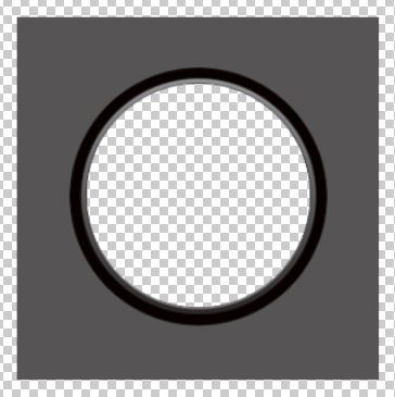
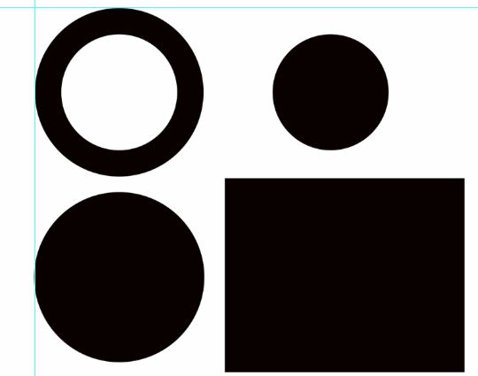
Here are the pictures but not sure which one I should use for the mask to hide the corners when the cover spins. Maybe you can tell me which mask to use and I would be able to figure it out eventually.


Posted Mon 19 Jan 15 @ 4:18 pm
I see no code for any actual mask for your rotating cover. See below :
(from my own skin V8 but by FRUiT)
<cover rotate="yes">
<size width="198-19-17" height="198-19-17"/>
<pos x="+19" y="+19"/>
</cover>
<button action="bs">
<size width="198+39+39-19-19" height="198+39+39-19-19"/>
<pos x="-37+19" y="-37+19"/>
<up x="1590-37+19" y="2112-37+19-20"/>
<clipmask x="1312-37+19" y="2112-38+19"/>
</button>
The part you must study is this <button action="bs"/> thing, which actually is the mask for the rotating cover. Particularly, you must follow and understand the "up" tag and the "clipmask" tag.
The "up" tag should pretty look like the first pic of your above post (the one with some gray corners)
The "clipmask" tag should be a true B/W usual mask.
See in my skin's PNG how to handle dimensions and positions of those two drawings, cause they ARE the cover's mask.
Posted Tue 20 Jan 15 @ 6:38 am
both a <visual> and a <button> with no action should work. What you actually need is just an overlay, something to cover the part of the rotating artwork so that its not visible, since the <cover> doesnt support masks.
You will need to take care of the following..
- Make the mask big enough so that the cover isnt visible when its in diagonal positions.
- Make sure the mask is B/W, meaning that the black should be 0,0,0 in rgb (which doesnt seem to be the case for the 1st pic you posted)
- If you use button, just make sure you have empty Tooltip .. <tooltip></tooltip>..so even action="nothing" should work that way.
- You will probably need to display other parts , like the PLAY buttons, textzones, songpos etc above the cover overlay, so just put the code for the jogs high enough in your xml (at least before the parts that eventually may be covered by the overlay).
PS. the action="bs" is not a vdjscript action... it is something i used in one of my first v8 skins..means BS.. lol before i came up with the empty tooltip way.
You mayuse whatever fake action you want of course ;)
Posted Tue 20 Jan 15 @ 10:14 am
Fruit wrote :
I see no code for any actual mask for your rotating cover. See below :
(from my own skin V8 but by FRUiT)
<cover rotate="yes">
<size width="198-19-17" height="198-19-17"/>
<pos x="+19" y="+19"/>
</cover>
<button action="bs">
<size width="198+39+39-19-19" height="198+39+39-19-19"/>
<pos x="-37+19" y="-37+19"/>
<up x="1590-37+19" y="2112-37+19-20"/>
<clipmask x="1312-37+19" y="2112-38+19"/>
</button>
The part you must study is this <button action="bs"/> thing, which actually is the mask for the rotating cover. Particularly, you must follow and understand the "up" tag and the "clipmask" tag.
The "up" tag should pretty look like the first pic of your above post (the one with some gray corners)
The "clipmask" tag should be a true B/W usual mask.
See in my skin's PNG how to handle dimensions and positions of those two drawings, cause they ARE the cover's mask.
(from my own skin V8 but by FRUiT)
<cover rotate="yes">
<size width="198-19-17" height="198-19-17"/>
<pos x="+19" y="+19"/>
</cover>
<button action="bs">
<size width="198+39+39-19-19" height="198+39+39-19-19"/>
<pos x="-37+19" y="-37+19"/>
<up x="1590-37+19" y="2112-37+19-20"/>
<clipmask x="1312-37+19" y="2112-38+19"/>
</button>
The part you must study is this <button action="bs"/> thing, which actually is the mask for the rotating cover. Particularly, you must follow and understand the "up" tag and the "clipmask" tag.
The "up" tag should pretty look like the first pic of your above post (the one with some gray corners)
The "clipmask" tag should be a true B/W usual mask.
See in my skin's PNG how to handle dimensions and positions of those two drawings, cause they ARE the cover's mask.
Fruit, I completely didn't see that part in the skin. I think I need to add it in but I now understand what you are saying and super big thanks to you for helping me with this. I will tool around with it and keep my toes crossed. Thanks again my good man for your time and help.
Posted Tue 20 Jan 15 @ 10:54 am


