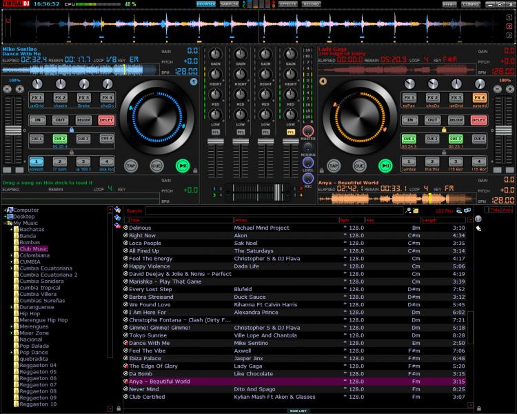
long time out from this forum but I have a new skin just for all you guys the new Mixer Zone hope you like my new work
just wait until it will be aproved

just wait until it will be aproved

Posted Fri 15 Mar 13 @ 7:46 pm
djdad wrote :
I am reviewing your skin..
Some things i 've mentioned..
1- Dropzones dont work for the bottom decks if those are not left or right
2. Kind of weird having the Hotcues flashing all the time.
3. PitchLock/Keylock need an icon there to tell what is what. Not easy to tell if u just look at the skin.
4. Kind of weird approach to have 4 effects but the FX sliders only to show for the selected one. I mean you cant tell from the skin for what effect those sliders are for. Maybe you should somehow highlight the selected one ?
5. The button says TAP, but its assigned as STOP
6. Smart Play for right decks should be near to the PLAY button as it is on left decks.
7. Reloop button is assigned as Loop, so it should say LOOP :)
Those are suggestions. The skin can be improved even if u dont fix them at all.
thank's for you comment but everyone have his own way to work and so drop zone if you like just opend the xml and edit how you like is not to hard to do, hot cues they tell u when is a cue point active ,fx to the date i dont see a controller with one knobo for each fx they have two o three slider but is for the active fx so you can controller the select fx for example i use a lot the echodopler fx and they have a lot of different fx if u move
the sliders, the tap button in a normal skin is actually is bpm but the skin i just made like my controller because i use with traktor software sametimes, smart button yea is different because how you mind i have to put on opositive way so u said that i have to put the buttons like smart play/play,cue.stop ???,the loop u right is should be reloop sorry for the mistake
Posted Sun 17 Mar 13 @ 3:47 pm
Skin is available
Download Link : http://www.virtualdj.com/addons/15767/Mixer_Zone.html
Download Link : http://www.virtualdj.com/addons/15767/Mixer_Zone.html
Posted Mon 18 Mar 13 @ 7:02 pm
Fabulous skin , the look of it is stunning , looks really slick and professional.
Are the Sync & Keylock buttons not part of it or am i missing them somehow. If they are not in it would it be possible to get this skin with the keylock and the sync button where the tap button is.
Can only imagine how good this would look if it had the video section incorporated into it and maybe a font resizer for the browser section. For me if it had them it would be the perfect skin and definitely one that vdj should look at when it comes to version 8 , the platters look superb too. Such a big improvement on the default platters and really makes it look in a completely different league.
Just two small things on the mixer section it says "HIGHT" instead of high and in the loop section it says "DELET" instead of delete.
There has been some amazing skins released over the last few weeks but this one is definitely right up there at the top of the heap.
Great work , very impressive.
Posted Mon 18 Mar 13 @ 7:54 pm
Eamon Ryan wrote :
Fabulous skin , the look of it is stunning , looks really slick and professional.
Are the Sync & Keylock buttons not part of it or am i missing them somehow. If they are not in it would it be possible to get this skin with the keylock and the sync button where the tap button is.
Can only imagine how good this would look if it had the video section incorporated into it and maybe a font resizer for the browser section. For me if it had them it would be the perfect skin and definitely one that vdj should look at when it comes to version 8 , the platters look superb too. Such a big improvement on the default platters and really makes it look in a completely different league.
Just two small things on the mixer section it says "HIGHT" instead of high and in the loop section it says "DELET" instead of delete.
There has been some amazing skins released over the last few weeks but this one is definitely right up there at the top of the heap.
Great work , very impressive.
Are the Sync & Keylock buttons not part of it or am i missing them somehow. If they are not in it would it be possible to get this skin with the keylock and the sync button where the tap button is.
Can only imagine how good this would look if it had the video section incorporated into it and maybe a font resizer for the browser section. For me if it had them it would be the perfect skin and definitely one that vdj should look at when it comes to version 8 , the platters look superb too. Such a big improvement on the default platters and really makes it look in a completely different league.
Just two small things on the mixer section it says "HIGHT" instead of high and in the loop section it says "DELET" instead of delete.
There has been some amazing skins released over the last few weeks but this one is definitely right up there at the top of the heap.
Great work , very impressive.
Thank you very much I was checking if there was same missing but oh my God I don't see that
IM sure have to luck again the high sorry for that keylock is there but is not named likedjdad said because is to big to put keylock in or top of
Them sync isn't available because we have to be more professional but sure is a good comment and I have space there to put the sync button
About video maybe With the next update but it will take a little longer because I don't have to much time
Condo DJ
DJTOTAL
Posted Tue 19 Mar 13 @ 10:03 am
Hi Again , thanks for the quick reply , absolutely love the skin used it all day to get used to it and it really does look unbelievably good. Had a lot of good feedback from other djs that saw it too. Switched between the default skin and yours and it was unanimous that yours was the nicer and more professional looking.
I understand where you are coming from about the sync thing , its just that sometimes its convenient to just hit the button and hey presto bpms are matched , and its now on all the major softwares and lots of pioneer products too. I don't depend on it but there are always times and gigs where it is comes in handy.
Still can't seem to find the keylock though lol , where is it , can you point it out for me please :)
Once again superb work and cannot wait to see what you come up with.
Posted Tue 19 Mar 13 @ 8:17 pm
Keylock and pitchlock are under pitch slider also pitch reset is there just click on top of 0
Posted Wed 20 Mar 13 @ 1:50 pm
Got it , was just a bit confusing for a bit , the key lock on deck 1 is on the right button under the pitch fader but on the left button for deck 2.
Thanks a million really happy now
Thanks a million really happy now
Posted Wed 20 Mar 13 @ 2:05 pm


