


 andytaylor125
Thanks for the info about the Cascada version. :-)
Yeah, the skin looks absolutely great, moving the track info was just a suggestion of what I might do if it was me. Hope it wasn't taken as a demand or a complaint or anything like that.
And yes, you can't ever have too much browser space! Especially when you're looking through long playlists trying to find that awesome track.
:-)
Posted Mon 31 Aug 09 @ 7:21 am
 tayla
tayla
how's it progressing dan ? any more update pics please... just been nosey as usual.
Posted Mon 07 Sep 09 @ 5:39 am
 Supacon
What resolution is this skin being designed for? I didn't notice that in the comments thus far...
Posted Wed 09 Sep 09 @ 9:05 pm
") Dan (djtouchdan)
Dan (djtouchdan)
still working on it!! bit time consuming!! lol
@supacon - 1440x900
@supacon - 1440x900
Posted Thu 10 Sep 09 @ 4:23 am
Supacon
Oh cool, same resolution as my video vision.
Speaking of which, I've just finished a release candidate, check out the thread for details if you wanna give me a hand testing again!
Speaking of which, I've just finished a release candidate, check out the thread for details if you wanna give me a hand testing again!
Posted Thu 10 Sep 09 @ 10:33 am
tayladjtouchdan wrote :
still working on it!! bit time consuming!! lol
@supacon - 1440x900
@supacon - 1440x900
you've been having those bl**dy sleep breaks again have'nt you....
Posted Fri 18 Sep 09 @ 3:19 am
Dan (djtouchdan)
no paul, i'm still here. LOL
i've been working on a bit of a redesgin acutally. I always take everyones opinions and suggestions on board. But ultimately i will create a skin that i like.
If i'm honest, as much as i could see what you guys were saying about more browser space, i didnt like having the video screens tucked up in the corner. So i have reworked things slightly, but did i compromise on browser space........NO!!
Using slightly smaller buttons, having looked at Supacons VideoVision 6 - it made me realise i dont need the buttons as big as i had them. The only people who need BIG buttons are those using touchscreens - and i can't see this being suitable for those guys anyway.
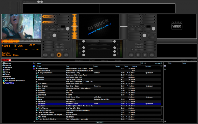
This skin is being designed in a 1440x900 resolution. The browser size (because i know you all want to know) is width="1423" height="446", thats a near as damn it to 50% of the screen!!
Anyways, a sneak peak of whats been going on:

i've been working on a bit of a redesgin acutally. I always take everyones opinions and suggestions on board. But ultimately i will create a skin that i like.
If i'm honest, as much as i could see what you guys were saying about more browser space, i didnt like having the video screens tucked up in the corner. So i have reworked things slightly, but did i compromise on browser space........NO!!
Using slightly smaller buttons, having looked at Supacons VideoVision 6 - it made me realise i dont need the buttons as big as i had them. The only people who need BIG buttons are those using touchscreens - and i can't see this being suitable for those guys anyway.
This skin is being designed in a 1440x900 resolution. The browser size (because i know you all want to know) is width="1423" height="446", thats a near as damn it to 50% of the screen!!
Anyways, a sneak peak of whats been going on:
Posted Fri 18 Sep 09 @ 4:07 am
tayla
looking good mate.
Posted Fri 18 Sep 09 @ 4:16 am
Dan (djtouchdan)
And the work continues...................... =)
Posted Fri 18 Sep 09 @ 7:47 am
tayla
like the choice of yellow/orange can't wait to see how it looks on the complete set up
Posted Fri 18 Sep 09 @ 8:01 am
 dj_alex_jarocho
omg that skin looks awesome, i like the colors.
i can see u used the logo i made for ya =)
i can see u used the logo i made for ya =)
Posted Fri 18 Sep 09 @ 3:23 pm
 djdad
djdad
Good work mate !
Posted Fri 18 Sep 09 @ 5:25 pm
tayla
oooops, might be a bit late in the day but on the line where you have the vdj logo move that upto top of page > left, not where you have that unused space either side of the four select buttons any chance now of putting six panels either side for samples/effects. just large enough so a name can be showing of the sample/effect, i drop a few comedy jingles/drops throughout the night and it would be handy to see visually what is in each box instead of opening up the sample section.... cheers.
Posted Sun 27 Sep 09 @ 1:44 pm
Dan (djtouchdan)
Now this is something i have looked into before Paul.
The only way i can see this working is to name the buttons "Sample 1"..."Sample 2".....etc and they be set to the slot on the sample page.
There doesnt seem to be a way in the script to have sample slots, like you can for effects, which ultimately enable you to change then on the fly.
Will look into it though =)
Posted Sun 27 Sep 09 @ 3:45 pm
tayla
thanks, what i was thinking if it were possible it was just a mirror of the original file if you know what i mean, so what ever they are named in the sample section you have the same in the browser area, god hope you can understand what i'm trying to get at it...
Posted Sun 27 Sep 09 @ 5:38 pm
Dan (djtouchdan)
Remarkably I do know what you mean. Lol.
This isn't possible in the current version. The reason being is there is only 1 text option for samples, which is %mainsample. This is the one on all the skins that has the drop down menu.
To do what you want, you need to be able to do sample slots, the same as we can currently do for effects. So the text option would read "%sampleslot1" "%sampleslot2", but it isn't possible at the moment.
This is something I think should be implemented asap in the next update even. It must be possible as it already exists for the effects section.
Hope your not too upset by my answer mate =)
Posted Mon 28 Sep 09 @ 1:37 am
tayla
crikey, even the wife just doesn't understand me... lol
bit of a pity, but thanks for taking the time to explain Dan, yep it would be nice if it could happen at some point in the future.
bit of a pity, but thanks for taking the time to explain Dan, yep it would be nice if it could happen at some point in the future.
Posted Mon 28 Sep 09 @ 4:06 am
Dan (djtouchdan)
Ok, well after hours of contemplating and thinking about the buttons i used in the original design. I decided i didn't like them - lol. I know there will be some of you out there that did like them, but i thought i could do better.
And in my opinion, i have done better.......
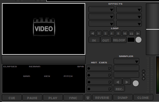
These are the unselected buttons, when they are idle and not doing anything:
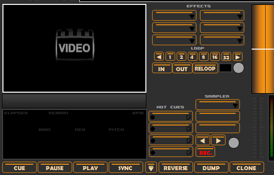
These are the selected buttons (when function is on):
There will also be an "over" set of buttons, when you hover the mouse over them - i haven't done these yet though, but will likely be the same as the unselected ones except the bar inside the button will illuminate orange.
I hope you will all agree these buttons look better - it has also freed up some space on the deck, what should i add in, what do you want to see?
Post comments as always.....Dan
And in my opinion, i have done better.......
These are the unselected buttons, when they are idle and not doing anything:
These are the selected buttons (when function is on):
There will also be an "over" set of buttons, when you hover the mouse over them - i haven't done these yet though, but will likely be the same as the unselected ones except the bar inside the button will illuminate orange.
I hope you will all agree these buttons look better - it has also freed up some space on the deck, what should i add in, what do you want to see?
Post comments as always.....Dan
Posted Tue 29 Sep 09 @ 9:55 am
tayla
just a suggestion, again, but would it not look better if as you have in the second pic this is when function is idle and give an illuminated effect when selected, as usual my two penneth worth....
Posted Tue 29 Sep 09 @ 10:58 am
Dan (djtouchdan)
Well, the for the first time in a VERY long time i have had a computing nightmare!!
My image file has corrupted itself. So whilst it shouldnt take me to long to re-create what i had because it is all fresh in my mind - it is bloody annoying!! Tried everything to get the damn thing to open with no success........God damn computers.
My image file has corrupted itself. So whilst it shouldnt take me to long to re-create what i had because it is all fresh in my mind - it is bloody annoying!! Tried everything to get the damn thing to open with no success........God damn computers.
Posted Tue 29 Sep 09 @ 6:34 pm