


") Dan (djtouchdan)
Dan (djtouchdan)
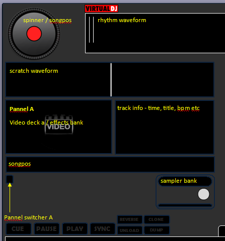
A teaser of what i'm currently working on - still a work in progress.
Any comments welcome, as always.
Any comments welcome, as always.
Posted Sun 23 Aug 09 @ 3:41 pm
 tayla
tayla
more browser space would be nice mate.
Posted Mon 24 Aug 09 @ 6:04 am
Dan (djtouchdan)
The browser is more than big enough - the screenshot above is just a snipet of the upper left corner. =)
Posted Mon 24 Aug 09 @ 11:17 am
tayla
wasn't directing the comment at this skin dan (especially as i cannot see it, lol) just normally the browser area in most skins is sacrificed, just like to see a bigger area as i'm now using larger fonts ( ) to help my vanity...
) to help my vanity...
Posted Mon 24 Aug 09 @ 12:57 pm
Dan (djtouchdan)
lol - have made some major changes already to the original screen shot.
> Native resolution of 1440x900.
> Alomst 50% of the screen will be for browser.
> 3 large video preview windows (Deck A, Deck B and Master)
> 6 Bank effects for each deck (Hercules RMX compatible)
> Scratch waveforms
> Clipbank selector from main skin (no need to go into effects tab)
___________________________________________________________________
If anyone else has any preferences or things they have seen on other skins they would like to see on a native 1440x900 skin then post here!!
(can't promise everything but i will consider everything)
Posted Mon 24 Aug 09 @ 1:05 pm
 aubs123
nice teaser looks and sounds interesting =)
Posted Mon 24 Aug 09 @ 3:50 pm
") dJ_ro_(ecu)
dJ_ro_(ecu)
It's cool, great brother
Posted Mon 24 Aug 09 @ 4:03 pm
Dan (djtouchdan)
Still a work in progress =)
Posted Tue 25 Aug 09 @ 12:13 pm
tayla
hey looking good mate, suggestion one of the guys has just got rid of the spinning wheels looks good and frees' up space for the browser.... 
Posted Tue 25 Aug 09 @ 3:10 pm
tayla
oh, and what about keeping all of the text yellow as you have in the top pics
Posted Tue 25 Aug 09 @ 3:12 pm
 djdad
djdad
Just an idea.
Put the video deck pannels on the bottom left and right corners, where the wheels are now. (We dont really need them). Free more space for browser.
Put the video deck pannels on the bottom left and right corners, where the wheels are now. (We dont really need them). Free more space for browser.
Posted Tue 25 Aug 09 @ 4:06 pm
Dan (djtouchdan)
Thanks for your input so far guys.
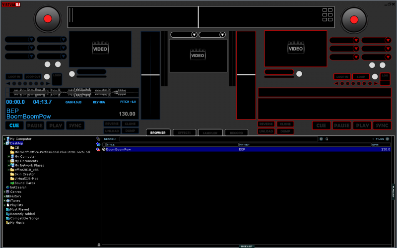
I have updated the graphics (only Deck A) and implemented the following changes:
> Removed VDJ spinner
> Reloacted video window to upper corners
> Enlarged the "Track Info" section which will also have the "songpos" inside
> Added 3 cue points (inside track info)
> Brightened the blue surround for Deck A
> Brightended the colours for the scratch waveform
> Moved the browser menu to inside the black section
> Increased browser size to 54% of skin
I have made the following changes to the code (not that you can see from the screenie) =)
> Changed all font colours to yellow
Posted Wed 26 Aug 09 @ 11:26 am
tayla
wey hey, can't wait for this one...
Posted Wed 26 Aug 09 @ 4:58 pm
Dan (djtouchdan)
another screenshot for you =)
Posted Sat 29 Aug 09 @ 12:58 pm
 andytaylor125
That looks very nice! :-)
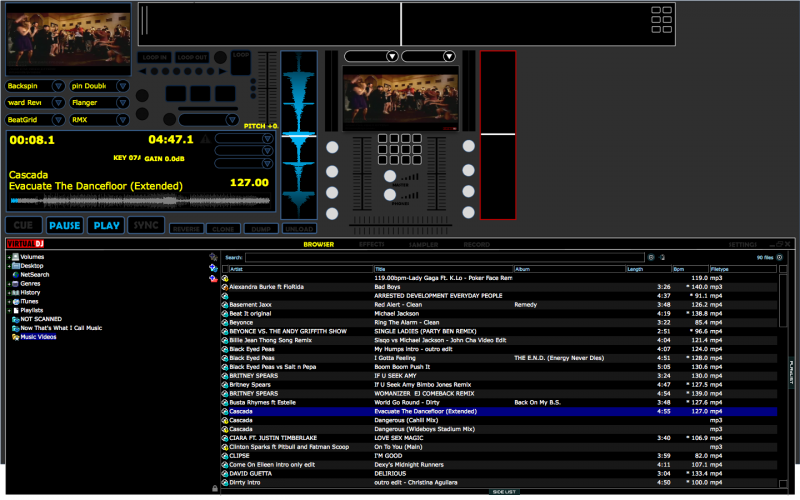
There seems to be quite a lot of plain black space where the song info is written, perhaps you could re-arrange some of that a bit to give more browser room.
Also, where did you get an extended video version of cascada-evacuate the dancefloor!? I could do with that in my collection! :-)
There seems to be quite a lot of plain black space where the song info is written, perhaps you could re-arrange some of that a bit to give more browser room.
Also, where did you get an extended video version of cascada-evacuate the dancefloor!? I could do with that in my collection! :-)
Posted Sat 29 Aug 09 @ 9:28 pm
tayla
looks nice with the yellow font, if it is to stark for some how about a bright orange.
Posted Sun 30 Aug 09 @ 11:19 am
tayla
just noticed, glad your keeping the sample block readily accessible on screen... cheers
Posted Sun 30 Aug 09 @ 11:24 am
Dan (djtouchdan)tayla wrote :
looks nice with the yellow font, if it is to stark for some how about a bright orange.
I am going to make all the fonts clickable, like in the default skin. So you will be able to click on it and change the colour.
Colour options will include, yellow (default), orange, white, blue or red (deck dependant).
Posted Sun 30 Aug 09 @ 11:25 am
Dan (djtouchdan)andytaylor125 wrote :
That looks very nice! :-)
There seems to be quite a lot of plain black space where the song info is written, perhaps you could re-arrange some of that a bit to give more browser room.
Also, where did you get an extended video version of cascada-evacuate the dancefloor!? I could do with that in my collection! :-)
There seems to be quite a lot of plain black space where the song info is written, perhaps you could re-arrange some of that a bit to give more browser room.
Also, where did you get an extended video version of cascada-evacuate the dancefloor!? I could do with that in my collection! :-)
Please bare in mind this is still a work in progress.
There are more things to be added into the text pannel yet - you guys are obsessed with browser space too -LOL
Smashvidz i think for the Cascade extended, possibly 8th Wonder. Can't remember.
Posted Sun 30 Aug 09 @ 11:28 am
tayla
just wait until you get to 23&3/4 you'll want a bigger browser area as well... lol
Posted Sun 30 Aug 09 @ 8:09 pm