


 listen2
No your not crazy I was not thinking deck wise with the sliders, more logic. Up is +pitch. Down is -pitch. I am working on another update that corrects this and even a few more fixes. I hope by the end of the week.
Posted Tue 01 Sep 09 @ 4:55 pm
") Dan (djtouchdan)
Dan (djtouchdan)
lol - no no L2, Jimmy is crazy =)
Posted Tue 01 Sep 09 @ 6:00 pm
 Tear Em 'Up
djtouchdan wrote :
lol - no no L2, Jimmy is crazy =)
+1... ;-)
Posted Tue 01 Sep 09 @ 6:09 pm
 jimmy b
TearEmUp wrote :
+1... ;-)
djtouchdan wrote :
lol - no no L2, Jimmy is crazy =)
+1... ;-)
lmfao!!!!!
listen2 wrote :
I am working on another update that corrects this and even a few more fixes. I hope by the end of the week.
Nice one mate, and thanks
Posted Wed 02 Sep 09 @ 3:00 am
 arsray
Good Work!
Posted Wed 02 Sep 09 @ 7:25 pm
 dj_alex_jarocho
OMG
This skin is a masterpiece!!!
Great work L2 you are my hero! =)
This skin is a masterpiece!!!
Great work L2 you are my hero! =)
Posted Fri 04 Sep 09 @ 6:55 am
listen2
A new update is up. A few changes and bug fixes. Still more coming soon.
Posted Sun 13 Sep 09 @ 7:15 pm
 serioussims23
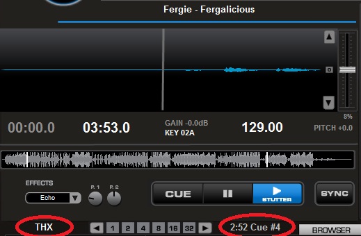
Great work ! THX
Posted Mon 14 Sep 09 @ 12:59 am
 aubs123
great update again nice work
Posted Tue 15 Sep 09 @ 3:45 pm
Hey!
Is this skin available for download anywhere else than here? If so, does anyone know where I can find it?
Or is it only exclusively to registered users in this forum with valid serial?
Regards,
mrdelta
Is this skin available for download anywhere else than here? If so, does anyone know where I can find it?
Or is it only exclusively to registered users in this forum with valid serial?
Regards,
mrdelta
Posted Sun 11 Oct 09 @ 9:20 pm
 discobrian24
It is only available to registered Pro users with a valid serial.
Posted Mon 12 Oct 09 @ 12:40 am
listen2
Any users of this skin have any suggestions you'd like to make? I find myself using this skin a lot, even when i use my other skins i always go back to this one.
I am making a audio only mini/compact version of this soon. So if you have suggestions for that too, i'd like to hear .. thanks
I am making a audio only mini/compact version of this soon. So if you have suggestions for that too, i'd like to hear .. thanks
Posted Fri 16 Oct 09 @ 10:04 am
 djcity
Cooooool. I spin audio only anyway.
Look to the features that were available on the old Mixstation skin and are available on the Over Flow skin. The Mixstation skin was great for having everything right there at your fingertips along with having all relevant info displayed within each deck.
The Over Flow skin does a very good job except it has all relevant info on the right side of the skin instead of per deck where I found it to be most helpful and functionable. (is that a real word?!?)
And you know what my #1 request is....1366 x 768 resolution.
Thanks L2
Posted Fri 16 Oct 09 @ 12:33 pm
hey i agree with city!
from my thread here are my suggestions for the new skin:
(please note these are only my opinion on what i think many people will consider aesthetically pleasing, and from the years of my dj experience in a club setting what i have found most useful. they are by no means to be misconstrued to project negative or derogatory judgments to any skin creator)
1)the platter in overflow looks a bit too rustic, (visually unappealing, done in paint i believe) whereas the old mixstation one looked futuristic. overflow does have the moving arm (as does c.e. i believe) but maybe we could somehow incorporate a moving piece into the old mixstation platter (maybe just a small marker that rotates and lets u know where you are).
2) the huge comparison bar on the far right of overflow does not need to be there! also, the font is way to large! mixstation had it all neatly within the description part of the skin right above the platter. i understand that there are more elements now (key signature) but im sure there is room for a few numbers or letters if there is room for a huggee side bar. making the platter and some fonts a bit smaller would resolve this issue painlessly.
mix station was a great but it could use "scratch waves" (but perhaps a differentiation between kick and snare like serato has in their waves). infact, this would be great if it was also attributed to the main mixing bar on top as well. also, we dont need to waste space with 12 different ways to display the visual baselines at the top (like in overflow).
and finally a hi-res version of this new skin.
Posted Tue 27 Oct 09 @ 5:46 pm
 luistfashion
I would like to propose a new version of C.E. Skin:
http://lh3.ggpht.com/_tbDDgG6dlyE/TJmvYKKRyCI/AAAAAAAADNU/D0TIf1PL6lA/s1024/CE-LUIS-T.gif
Major differences:
- 4 Effects Slot.
- 1 Sampler Slot.
- Bigger track Graphic (structure).
- Smaller Browser.
If is possible to "built" this skin...i think it would be the best!
In the actual one, with my rmx isn't possible to view the selected effect on screen. Difficult to work like that.
Thanks in advance.
Posted Wed 22 Sep 10 @ 2:28 am
listen2
Thanks for the suggestion, i'm currently considering updating many skins but i am awaiting fome future changes.
Posted Wed 22 Sep 10 @ 9:01 pm
 DHoude
I made some specific ones for my situation. But these could benifit many others:
- My NSFX appered not to change the sound effect. It actually was, but the skin was not reporting it until I changed the effect slot command to "%maineffect". Now it works fine and shows a change when the knob is turned.
- I also added a sample slot to mine as well. The NSFX can change samples, but I never knew which one I was on, until I added this field. I don\'t have your snazzy graphics, so mine is just text in an unused portion of the screen.
During debug of my own modifications, Jeremy K's skin editor found two extra ">". I forget what lines, but they did not cause an issue. Just a small side note.
Pesonally, I love the "%Ptocue1" countdowns and made them default. They are PERFECT! But I added a right click to those CUE numbers to name the CUE point.
Last and this one may be more my style. I added a comment field to each deck. I am mixing videos and some times there is a break in the middle of the video. I put the time that break happens in the comment field and the CUE # to hit at that time. Once loaded and I am looking for other songs, that data is no longer in front of me. So I put a comment field on the deck in to show the comments of the song loaded in that deck. Handy, but not for everyone.
Your skin is awsome, by no means did I mean to mod it this much. I just added small easy things allong the way that helped me. I am hoping they will help others.
I can supply the code, etc, but my visible mods are just text shown below. I think all I would want is a nicer sample slot with a volume knob. But that is just picky as what I have is fine and the NSFX shows the volume position for the loaded sample.
Posted Fri 24 Sep 10 @ 2:01 am
DHoude
Oh yea, I vote no on the smaller browser. It is good, I would like more, but it is not needed.
Not sure about the "track graphic". I think it is pretty perfect the way it is. My small changes do help though.
4 effect slots, I would have liked them on my RMX, I will give you that. But maybe put it on a selectable panel (via an "RMX" button at the top) so that the 4 or 6 slots can have the DJC command (fixing his issue). Then the rest of us can have the clean look of the 1 effect slot and have room for the new sample slot.
Many RMX users are LE though and won't have access to the skin though
Posted Fri 24 Sep 10 @ 2:18 am
DHoude
Maybe make the individual deck waveforms smaller, to make some room for new 4 deck capability! Maybe just basic deck 3 and 4 controls. Not all the sample and effect slots, etc.
Also, another idea would be, instead of just the PFL indicator above the deck. Maybe make the moving waveform for that deck be grey until you are controling that deck. For instance:
When you are controling deck 1 and 2 they are standard blue and red waveforms. When you switch to control deck 3, deck 1 goes to gray and deck 3's wavefom would be blue. In that instance deck 2 (unchanged) would still be red and deck 4 would be gray, untill you switch to control deck 4.
Posted Sat 25 Sep 10 @ 8:29 pm