PhantomDeejay wrote :
That's why OSD layout exists (on the same skin)
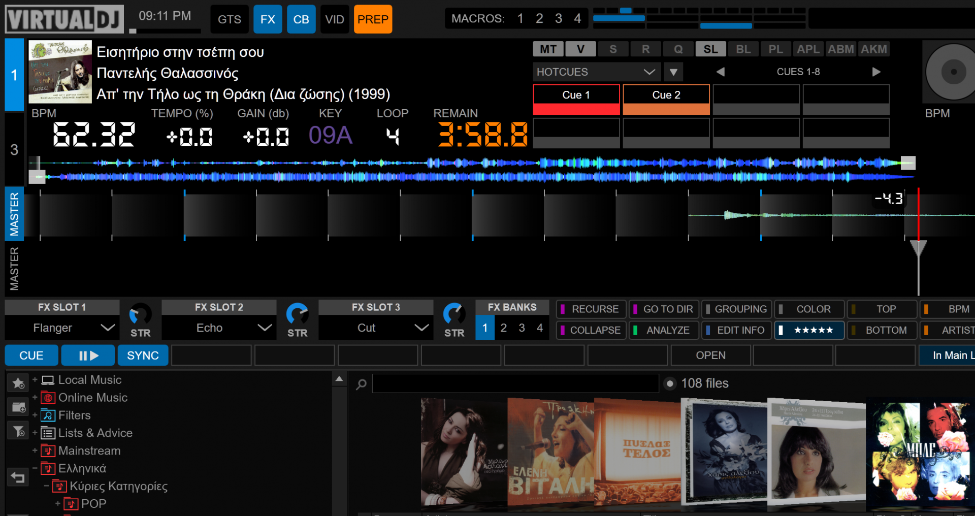

yea but you chose to not give the vertical waves option in osd .
Posted Thu 01 Apr 21 @ 7:05 pm
If I'm going to put vertical waveforms on OSD, then I'll need to add more height for the waves themselves as they are not going to be tall enough to see anything useful on them.
Doing so leaves more empty space that needs to be filled with something...
In fact the new layout I posted above was created because some users wanted taller vertical waves than the default 2 deck layout of the skin.
So the extra space had to be filled with something, hence the jogs and some more elements.
Finding the perfect balance for one user is not difficult. Finding the best balance for multiple users is!
PS: I still think the jogs provide useful info as is, since they also hold the times, the pitch, the pitch range and the current BPM.
On the screenshot above BPM is listed twice, but BPM on top (not on jog) can be switched to show the original BPM of the track and not the current/live BPM which is also something a few users asked for. :)
Posted Thu 01 Apr 21 @ 7:51 pm
Hey there!
Amazing skin! so practical and the positioning of everything is amazing. Just a quick question is it possible to change the effects bank from 3 to single bank effect? I can't seem to find anywhere to do it.
Euxariosto! Para Poli, yia tin hperoxi thoulia sou.
Steph
Amazing skin! so practical and the positioning of everything is amazing. Just a quick question is it possible to change the effects bank from 3 to single bank effect? I can't seem to find anywhere to do it.
Euxariosto! Para Poli, yia tin hperoxi thoulia sou.
Steph
Posted Tue 20 Apr 21 @ 3:09 pm
No, it's not currently possible. I'll try to add on the next update.
Thank you for your kind words!
Thank you for your kind words!
Posted Tue 20 Apr 21 @ 5:07 pm
Hi Phantom,
I have a couple of issues with the skin.
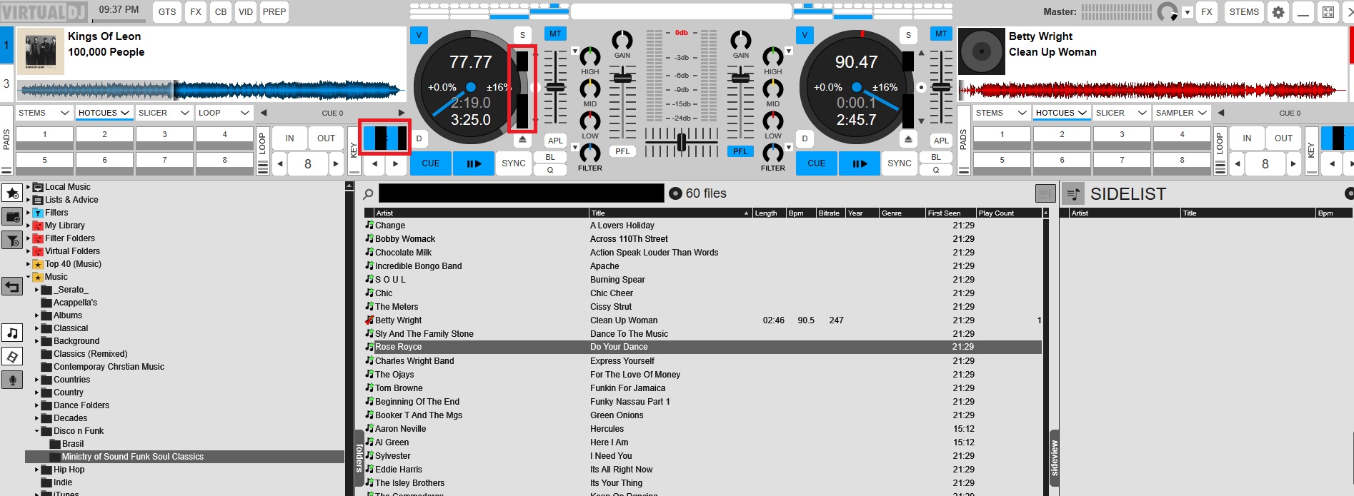
I have a couple of issues with the skin.

Posted Mon 04 Oct 21 @ 8:45 pm
Any chance you can have option to change colour to light grey, the black is too black and the white too white lol.
Posted Mon 04 Oct 21 @ 8:51 pm
Charlie Wilson wrote :
Hi Phantom,
I have a couple of issues with the skin.

I have a couple of issues with the skin.

Those issues are usually due to graphics card driver errors.
What GPU do you have/use ?
Are the drivers updated to their latest version ?
Posted Thu 07 Oct 21 @ 11:45 am
Charlie Wilson wrote :
Any chance you can have option to change colour to light grey, the black is too black and the white too white lol.
I can try to come up with a nice "gray" theme but actually the colors used are no different than those used by most apps (including Windows, Chrome, e.t.c.) when they run with "dark theme / mode" active.
Also I see no point to make white "less white" since it's meant to be used outdoors to increase contrast and visibility under sunlight.
Posted Thu 07 Oct 21 @ 11:49 am
Charlie, how about this?


Posted Mon 11 Oct 21 @ 5:17 pm
Version 1.4.0 (11/19/21) Pending approval
- Added "2 Decks Split" view
- New Browser Zoom Layout with more browser space
- Added small record panel on top bar for all views
- Improved VU Meters
- Code cleanup
- Various small improvements and tweaks.
2 Decks "Split" Preview:

- Added "2 Decks Split" view
- New Browser Zoom Layout with more browser space
- Added small record panel on top bar for all views
- Improved VU Meters
- Code cleanup
- Various small improvements and tweaks.

Posted Fri 19 Nov 21 @ 9:06 am
Version 1.5.0: (Pending)
-Added "2 Decks Compact" layout ("2 Decks Split" layout clone, with wide waveforms)
-Added two new browser color schemes (Bright White & Bright Blue)
-Added custom prelisten player as an option on the top bar central area
-Added "2 Decks Compact" layout ("2 Decks Split" layout clone, with wide waveforms)
-Added two new browser color schemes (Bright White & Bright Blue)
-Added custom prelisten player as an option on the top bar central area
Posted Tue 04 Jan 22 @ 10:25 am
Hey, I like your skin a lot. I use it for my gigs. It has all the features I wished for.
I noticed one thing, and I am not sure if it is a bug or a new feature, but I believe it wasn't there before. Let me explain:
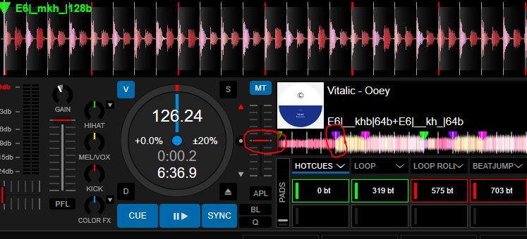
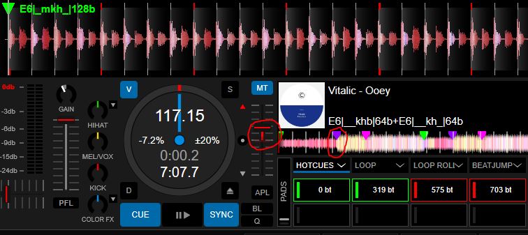
I noticed that the vertical lines every 32 beats in the timeline (the 8-bar grid) shrink or expand as I move the tempo slider. That makes very little sense to me - effectively, if I had a Cue placed on, i.e. the 32nd bar (128th beat) as highlighted in the picture and I speed the track up or down, the Cue looks as if it were somewhere else (i.e. like I placed it on the beat 115 or 135).
I love the feature - it makes long beat mixing without preparation so much easier, but this seems to be a bug, and it makes things confusing again. Looks like the "grid" is not related to the number of beats, but to time - maybe it is configurable, and I changed something, but can it be please related to beats? Thank you.


Posted Tue 01 Mar 22 @ 10:20 am
I found the issue and it will get fixed on next update.
The script that I use to place those markers needs both BPM and total time of the song.
While the script correctly uses the absolute (original) BPM of the track, it didn't use the absolute (original) total time.
Therefore in big pitch changes and in large tracks it would drift the position significantly.
Posted Tue 01 Mar 22 @ 10:30 am
Thanks
Posted Tue 01 Mar 22 @ 10:35 am
I insert a lot of info into the Cue texts, and at the same time, I use the "remaining beats" display for Cues. It helps me to start beat mixing at the right spot without having to prepare a set of Cues/markers such as "Outro in 64beats", "Outro in 32beats", and so on.
Would it be possible to either allow both information to be in the Cue button, i.e. "-61, Cue title"? Or even better, would be a possibility to have a dedicated floating window that would show Cue titles (whilst keeping the remaining beats on the Cue buttons). Thanks a lot. It is genuinely well-thought-out skin.
Would it be possible to either allow both information to be in the Cue button, i.e. "-61, Cue title"? Or even better, would be a possibility to have a dedicated floating window that would show Cue titles (whilst keeping the remaining beats on the Cue buttons). Thanks a lot. It is genuinely well-thought-out skin.
Posted Fri 04 Mar 22 @ 2:47 pm
Hi, I have just switched to the OSD 4 deck view and some text fonts are too large.
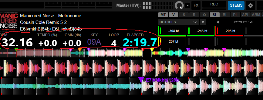
Is there something I could configure to adjust it?
I tried playing with Windows font sizes and built-in Windows scaling, with no effect. I suspect I miss a font, can you tell me its name? I will donwload it.

Is there something I could configure to adjust it?
I tried playing with Windows font sizes and built-in Windows scaling, with no effect. I suspect I miss a font, can you tell me its name? I will donwload it.
Posted Tue 22 Mar 22 @ 12:06 pm
Inside the GTS-2K21.zip file that's on your skins folder (Documents\VirtualDJ\Skins) there's a font file named "LCD"
Extract the font from the zip file and install it on your system.
Extract the font from the zip file and install it on your system.
Posted Tue 22 Mar 22 @ 12:17 pm
Thank you, it worked (as always).
Would you please look into my question from the previous post, too? I would like to see (at the same time) the remaining beats for a HotCue and also the text (the name) of the HotCue. Is there a way how to achieve this with the skin or with some additional VDJ window? The window Edit POIs is linked to a track, not to a deck...
Would you please look into my question from the previous post, too? I would like to see (at the same time) the remaining beats for a HotCue and also the text (the name) of the HotCue. Is there a way how to achieve this with the skin or with some additional VDJ window? The window Edit POIs is linked to a track, not to a deck...
Posted Tue 22 Mar 22 @ 1:12 pm
For PADS (because technically they are pads, not hotcue buttons) while it is possible to "hack" them and make them show dual information, I would rather not to do that.
For hotcues I can surely make a pop-up window that shows as many info as you want.
However:
1) What info should it show per cue ?
2) The pop-up should be different per deck, or one window should show info for both decks ?
BTW: Todays update has also the fix for the markers moving around with pitch changes...
Posted Tue 22 Mar 22 @ 1:20 pm
Thanks a lot for the fix. I appreciate it very much. I have just installed and tested the update, and I can confirm the reported issue is gone.
I am asking to add an option for the Pads text. Currently, it is either beats or names. I propose to add a third option, beats + names.
If the space is insufficient for the usual amount of text (see below for my use case), then the name part of the Cue could be scrolling (same as when, i.e. a song title is too long and does not fit). Another option could be an overlay window with a list of pads per (or for each) deck, but I am not sure if it is a good idea nor what it really means to have 2 to 4 windows open.
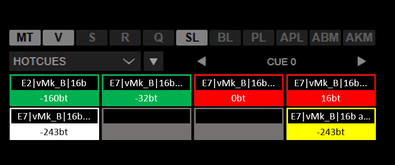
My use case is the following:
I add a short "code" as a name to each PoI. I try to keep it short (and therefore, it is a bit cryptic, but I reckon it is pretty easy to get used to it).
For HotCue PoIs, it tells me the energy of that section, what parts of the music (= v/m/k/h/b stems) are present (and how much of them, by using capital or small letter or underscore) and how long is that section. So my typical HotCue PoI (and therefore Pad) name is E7|vMk_B|128b which means Energy 7, filterable Voice, full Melody, filterable Kickdrums, no Hi-hats, full Bass, duration 128b
I have the same code with a small addition of the word loop for saved loops, so an example would be "E7|vMk_B|16b loop".
If I use an action, i.e. to automatically engage the loop, I put a text like "E7|vMk_B|16b a-loop".
If I use some unique action, I describe it with a short text like "Skip next 64b".
If it makes no sense for a Pad to have remaining beats, you could simply keep the name and not show the remaining beats (same as now, an example could be Beat Jump Pads).
I am asking to add an option for the Pads text. Currently, it is either beats or names. I propose to add a third option, beats + names.
If the space is insufficient for the usual amount of text (see below for my use case), then the name part of the Cue could be scrolling (same as when, i.e. a song title is too long and does not fit). Another option could be an overlay window with a list of pads per (or for each) deck, but I am not sure if it is a good idea nor what it really means to have 2 to 4 windows open.

My use case is the following:
I add a short "code" as a name to each PoI. I try to keep it short (and therefore, it is a bit cryptic, but I reckon it is pretty easy to get used to it).
For HotCue PoIs, it tells me the energy of that section, what parts of the music (= v/m/k/h/b stems) are present (and how much of them, by using capital or small letter or underscore) and how long is that section. So my typical HotCue PoI (and therefore Pad) name is E7|vMk_B|128b which means Energy 7, filterable Voice, full Melody, filterable Kickdrums, no Hi-hats, full Bass, duration 128b
I have the same code with a small addition of the word loop for saved loops, so an example would be "E7|vMk_B|16b loop".
If I use an action, i.e. to automatically engage the loop, I put a text like "E7|vMk_B|16b a-loop".
If I use some unique action, I describe it with a short text like "Skip next 64b".
If it makes no sense for a Pad to have remaining beats, you could simply keep the name and not show the remaining beats (same as now, an example could be Beat Jump Pads).
Posted Tue 22 Mar 22 @ 2:56 pm


