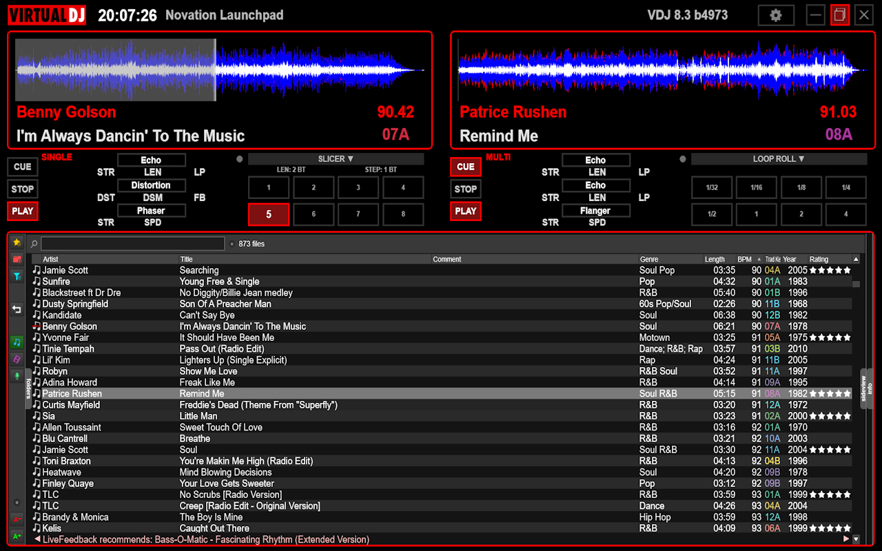
I've been working on this for a few weeks now, in my spare time. I think it's finished, for my purposes.

It's been deliberately made at 1280x800, the screen res of my old Sony VAIO, recently updated from Windows XP to Windows 8.1, which I still use for gigs.
The screen size is 15.4" so IMO the vast majority of 1920x1080 skins look & feel too cramped (small buttons, knobs, text etc).
As it will be used with a controller, it only shows the stuff that the controller can't. Transport buttons are purely for convenience.
There's a choice of background colours, and almost no bitmap graphics. It's all drawn by VDJ itself.
Posted Sun 02 Jun 19 @ 7:29 pm
look nice
Posted Sun 02 Jun 19 @ 7:53 pm
looks great. love the simplicity.
send to my email if possible, thnx.
send to my email if possible, thnx.
Posted Mon 03 Jun 19 @ 1:17 am
All you need and nothing else, I like it.
How's the vector stuff to work with compared to the old way?
What's the Launchpad label there for.?
How's the vector stuff to work with compared to the old way?
What's the Launchpad label there for.?
Posted Mon 03 Jun 19 @ 3:24 am
The vector stuff is great because it’s far easier to resize or move around or change colour. The Launchpad is what’s connected - the text shows your controller name.
Posted Mon 03 Jun 19 @ 11:59 am
looks good
Posted Fri 05 Jul 19 @ 1:19 pm
Simple & to the point great looking too love the color Key, if you're willing to share will love to get a copy...Congrat & Thanks.!!!
Posted Fri 05 Jul 19 @ 3:10 pm


