faster than the milennium falcon.....that was really quick....thanks Rune...;-)
Posted Sun 11 May 14 @ 5:14 pm
I've recoloured the site to my tastes, bright white is too much for me to look at. I see we're no longer posting blind to the rest of the thread (previous messages) good stuff , the footer makes sense.
[can I put anything in square brackets?]
Nice!
[/mugged]
And I can quote, good stuff, * edit* hang on, no I can't quote. Is NOBBC that big a deal for NLU?
[can I put anything in square brackets?]
Nice!
[/mugged]
And I can quote, good stuff, * edit* hang on, no I can't quote. Is NOBBC that big a deal for NLU?
Posted Sun 11 May 14 @ 5:28 pm
It would be nice to have a few different forum themes (color schemes) to choose from. Light, dark etc.
Posted Sun 11 May 14 @ 5:32 pm
groovindj wrote :
It would be nice to have a few different forum themes (color schemes) to choose from. Light, dark etc.
yes, might make a theme switch button.. "night mode/day mode" .. .its a bit cola and pepsi . .some prefer dark, some light ..
and myself I like dark when its dark out (less bright screen)
But overall its not as bright as facebook, google+ and most other sites even as it is ;)
Posted Sun 11 May 14 @ 5:44 pm
Yes please! VDJ fans are used to having skins and changing appearances. :-)
Posted Sun 11 May 14 @ 5:56 pm
Love the new look...GTG on the Galaxy III and thanks for looking into the search feature that was suggested earlier.
Posted Sun 11 May 14 @ 5:57 pm
I like the old one better. This one on my IE has comments in bold letters. It's kinda like shouting. Gets hard to take after a while.
There is a lot of wasted space like the screen is zoomed in thus less comments per page. Lots of scrolling now.
I agree the white is hard to take after a while. A nice pastel color would work well.
Happy tweaking. And thanks for the upgrades.
There is a lot of wasted space like the screen is zoomed in thus less comments per page. Lots of scrolling now.
I agree the white is hard to take after a while. A nice pastel color would work well.
Happy tweaking. And thanks for the upgrades.
Posted Sun 11 May 14 @ 6:08 pm
I've got quite a few forum pages that are not showing properly on my iPad with this new forum.
Some are ok, but most cut off the right hand side a little bit.
Just thought I'd mention it in case it's helpful.
Great job though with everything, thanks!
*****edited to change the word 'Beta' to 'Great' as it was meant to be, iPad autocorrect. Also to add the following, - I can not zoom anymore on iOS either. *****
Cheers!
Posted Sun 11 May 14 @ 6:14 pm
yes the old forum table based layout will not be optimal for phone/pad use yes .. will come ;)
Posted Sun 11 May 14 @ 6:19 pm
contrast on forum also set a little lower now to be easier for tired eyes ;) (Shift + reload page for update)
Posted Sun 11 May 14 @ 6:30 pm
I find it much easier to read on my IPad, although occasional a small glitch appears. When loading a page th IPad occasionally chops off the right hand side of the page. Not happening all the time and rotating from portrait to landscape seems to bring it back into line.
Otherwise very pleased with what I have seen so far.
Nice work :-D
Daz
Otherwise very pleased with what I have seen so far.
Nice work :-D
Daz
Posted Sun 11 May 14 @ 10:48 pm
The web site is loading much faster. Good job.
I don't seem to be able to zoom any more with my ipad however. Sometimes I would fat finger the links. I got into the habit of just zooming a little to work around this.
I don't seem to be able to zoom any more with my ipad however. Sometimes I would fat finger the links. I got into the habit of just zooming a little to work around this.
Posted Sun 11 May 14 @ 11:16 pm
RobRoy wrote :
faster than the milennium falcon.....that was really quick....thanks Rune...;-)
Since VDJ 8 isn't quite available yet, I guess they haven't made the Kessel Run in 12 Parsecs yet.
I like the improvements and I also like the improvements made to VDJ and with returning to doing mobiles I have an excuse to upgrade.
Posted Sun 11 May 14 @ 11:23 pm
Not sure if this has already been stated so forgive me if it has...
With regards to the forums ...when a thread has a picture posted in it all of the posts and picture is cut off on the right. The text is not wrapping around. This occurs on both iPad mini and Samsung Galaxy Phone.
To me this is a huge problem as there have been many times I have made posts for help when at a gig. Now if someone posts a picture in the thread I created I will not be able to read / scroll right to read everything that has been posted.
Posted Sun 11 May 14 @ 11:51 pm
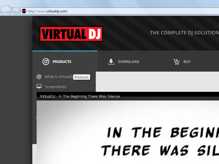
Hey VDJ folk... you need to adjust the zIndex of the drop-down menus as they pop-under the YouTube video (on IE9).


Posted Mon 12 May 14 @ 4:25 am
rmundell wrote :
Hey VDJ folk... you need to adjust the zIndex of the drop-down menus as they pop-under the YouTube video (on IE9).
Yes I was about to report that just now... I'm using IE 8.0.7... at the moment.
And I too have the bold letters.
Another thing I found

Dazmax wrote :
I find it much easier to read on my IPad, although occasional a small glitch appears. When loading a page th IPad occasionally chops off the right hand side of the page.
I found out that this only happens if there is a picture embedded in a comment.
A site without a picture is displayed correct (Galaxy S3)
blckjck wrote :
I don't seem to be able to zoom any more with my ipad however. Sometimes I would fat finger the links. I got into the habit of just zooming a little to work around this.
That is caused by the bootstrap framework the new site is working with.
Bootstrap is designed "mobile" first. That means that it "should" render fine for mobile devices and adjust itself to the space provided by your device. However it might need a little tweaking.
Posted Mon 12 May 14 @ 4:36 am
PachN wrote :
I'm using IE 8.0.7... at the moment.
Kill it! Kill it now!!!!
Posted Mon 12 May 14 @ 5:02 am
love it..much easier and i think community will grow..loving the simplicity of the site..before it was a bit hard to find stuff..i think this is pure awesome..
:)
:)
Posted Mon 12 May 14 @ 7:11 am
so it is the time to have a personal tablet....;-)
Posted Mon 12 May 14 @ 9:03 am
actually ment the manufacturer with the fruit as a company logo which grows on trees...;-)
Posted Mon 12 May 14 @ 9:07 am


