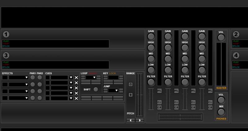
I much prefer having fully spelt out descriptions as opposed to abbreviations as in the original.


Posted Thu 15 Sep 11 @ 1:27 pm
Phantom feel free to post updates. Im really intrigued to see the way its progressively developing. Its a good way for non-skinners to learn what goes into the process.
Posted Thu 15 Sep 11 @ 3:56 pm
The best way to learn is to get in there and get your hands dirty............
Just Saying
Huey
Just Saying
Huey
Posted Thu 15 Sep 11 @ 5:21 pm
Charlie Wilson wrote :
I much prefer having fully spelt out descriptions as opposed to abbreviations as in the original.


Yes, but they take away precious screen space...
I could make it like the original but then I would have to make the times reading in a smaller font. Between smaller font and abbreviations I opted for the second. However I will post an update tommorrow...
Posted Thu 15 Sep 11 @ 5:27 pm
The best thing about this skin is the fact that it doesn't have spinning records
Posted Fri 16 Sep 11 @ 11:45 am
Oh,Oh there goes my 4 decks concept!.....actually its Best to have a skin for different situations and this is where Virtual Dj Shines!! I've been hearing the Anti-Platter Argument (sorry Charlie but you know I still Luv Ya!...right?) and I'm here to say when its time for me to want to feel like I'm in front of my Old turntables (thats most of the time for me)..then I bring on them wheels of steel!....
Posted Sat 17 Sep 11 @ 12:54 am
Two questions:
On the sampler, the "4" is the loop size ?
The "4" on the Skip section is to jump 4 beats ahead ?
Thank you!
On the sampler, the "4" is the loop size ?
The "4" on the Skip section is to jump 4 beats ahead ?
Thank you!
Posted Wed 21 Sep 11 @ 4:47 am

Just a quick update... I didn't had much time the last couple of days but now I'm back.
Posted Wed 21 Sep 11 @ 7:37 am
Posted Wed 21 Sep 11 @ 7:55 am
just a suggestion phantom, you should use some of the spare decks for the samplers instead of the built in one, that way you could include a waveform, drag and drop, effects, video sampler etc... it would take vdj to a the new level of useability.
for the mixer i vote 3-1-2-4 anything else is to confusing on screen as decks 2 and 3 no matter the layout are not inline with each other with exception to grom 4 deck layout.
love the look and features of this skin great job :)
for the mixer i vote 3-1-2-4 anything else is to confusing on screen as decks 2 and 3 no matter the layout are not inline with each other with exception to grom 4 deck layout.
love the look and features of this skin great job :)
Posted Wed 21 Sep 11 @ 8:12 am
Looks good,
Is it possible for you to include a button to make the wave form disappear in order to maximise browser space? Please say yes.
PS,
Refreshing not to see spinning wheels! @ Tracker :)
Don't forget "Get Food"
Dont get the whole 1-2-3-4 or 3-1-2-4 thing, please explain.
Is it possible for you to include a button to make the wave form disappear in order to maximise browser space? Please say yes.
PS,
Refreshing not to see spinning wheels! @ Tracker :)
Don't forget "Get Food"
Dont get the whole 1-2-3-4 or 3-1-2-4 thing, please explain.
Posted Wed 21 Sep 11 @ 12:41 pm
The mixer has 4 up-faders. They can be assigned (from left to right) either to decks 1-2-3-4 or to decks 3-1-2-4. ..
Posted Wed 21 Sep 11 @ 1:40 pm
Charlie Wilson wrote :
Is it possible for you to include a button to make the wave form disappear in order to maximise browser space? Please say yes.
Is it possible for you to include a button to make the wave form disappear in order to maximise browser space? Please say yes.
YES!
Posted Wed 21 Sep 11 @ 1:41 pm
Great,
What does CL, CR and Prog stand for

What does CL, CR and Prog stand for

Posted Wed 21 Sep 11 @ 2:18 pm
Crossfader Left Side
Crossfader Right Side
These buttons will change... Right now they don't fit the overall theme of the skin.
Crossfader Right Side
These buttons will change... Right now they don't fit the overall theme of the skin.
Posted Wed 21 Sep 11 @ 2:25 pm
It's not "Prog" It's "Prod" and it's part of the comment tag of the track. That's where you will be able to see the comment of the loaded track...
Posted Wed 21 Sep 11 @ 2:31 pm

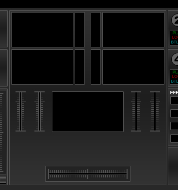
Video Panel (Incomplete)
Posted Thu 22 Sep 11 @ 7:34 am
George (Phantom), i think VU meters and volume sliders should go together, even if you have to squeeze the video windows or the sliders &VU themselves .
Posted Thu 22 Sep 11 @ 8:46 am
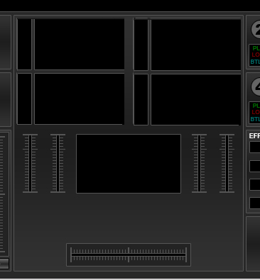
I love the video panel but I would prefur it to look like this.

This isn't my skin so they are just suggestions.
Having thought of the old 1234 situation I think 1234 would work best for the faders for ease of use.
Can you add volume boost for headphones at the top of the screen near config button as in VirtualDJ6-mod skin - see below.

Is it possible that once this is set that it is remembered for each time you open VDJ?
Also Master Balance


This isn't my skin so they are just suggestions.
Having thought of the old 1234 situation I think 1234 would work best for the faders for ease of use.
Can you add volume boost for headphones at the top of the screen near config button as in VirtualDJ6-mod skin - see below.

Is it possible that once this is set that it is remembered for each time you open VDJ?
Also Master Balance

Posted Thu 22 Sep 11 @ 9:27 am
Balance, gain boost, get food and video screen button would be good along side the buttons on the top right hand side of skin as seen below.


Posted Thu 22 Sep 11 @ 10:37 am


