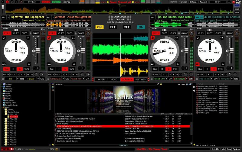
Ok putting things on the turntable is a possibility but as for the color of the waves I have no desire to change that. Thanks for the suggestions as they are always welcomed.
Thanks for the time
Huey
Thanks for the time
Huey
Posted Mon 08 Nov 10 @ 10:08 am
Hi huey,
i really enjoy using your skin as it gives me a Serato feel.
SUGGESTIONS:
how about for v3, you can maybe have a choice in the scratch panel from vertical to Horizontal? or maybe add an effects panel in the center that have slots for 4 effects per deck? you know, kind of like the SSLover skin? and instead of decks being ordered as 3,1,2,4, maybe 1,3,2,4?
as i stated these are merely suggestions, but don't change anything! just add onto it because even v1 was exceptional!
Posted Mon 15 Nov 10 @ 2:53 pm
Nice I\'m glad you guys are liking the skin!!
Heres a preveiw of what I have been working on

Stay Tuned....................
Huey
Heres a preveiw of what I have been working on

Stay Tuned....................
Huey
Posted Mon 15 Nov 10 @ 7:54 pm
that is sick!
Posted Mon 15 Nov 10 @ 7:59 pm
always innovating friend,skin beautiful congratulations
Posted Tue 16 Nov 10 @ 1:16 am
that kinda sucks that a white background stays behind the txt... oh well it really does look sharp!
Posted Tue 16 Nov 10 @ 2:25 am
Looking good there boss!!
Good work huey =)
Good work huey =)
Posted Tue 16 Nov 10 @ 5:03 am
Hi
Many thanks, but halfperfect..... :-)
Look here, to see perfect jogwheels....
http://www.virtualdj.com/forums/134696/Virtual_DJ_Skins/my_scratch_skin.html?page=1
And perhaps the scratchlines vertical....
But as I say.... MANY Thanks, for your Job
chris
Many thanks, but halfperfect..... :-)
Look here, to see perfect jogwheels....
http://www.virtualdj.com/forums/134696/Virtual_DJ_Skins/my_scratch_skin.html?page=1
And perhaps the scratchlines vertical....
But as I say.... MANY Thanks, for your Job
chris
Posted Tue 16 Nov 10 @ 5:44 am
@DJGCE, Yeah I dont know of any way around it but it'll do, lol!
@Alex, Thanks big homie!!
And @wbbrothers, halfperfect, lol!! Your to funny some days.
Thanks for all the feedback and suggestions, together we'll make this thing badass......................
Huey
@Alex, Thanks big homie!!
And @wbbrothers, halfperfect, lol!! Your to funny some days.
Thanks for all the feedback and suggestions, together we'll make this thing badass......................
Huey
Posted Tue 16 Nov 10 @ 6:48 am
Why should i not say " Halfperfect" :-)
I don´t want so say "semiprof"
Because the skin in funktion is professional, and the rest and my wishes are only in my opinion.
Grüße in Deutsch
wbbrothers
I don´t want so say "semiprof"
Because the skin in funktion is professional, and the rest and my wishes are only in my opinion.
Grüße in Deutsch
wbbrothers
Posted Wed 17 Nov 10 @ 4:55 am
Hi Huey,
nice work....and imo perfect! ;o)
Greets
nice work....and imo perfect! ;o)
Greets
Posted Thu 18 Nov 10 @ 3:36 am
beatbreaker1 wrote :
Nice I\'m glad you guys are liking the skin!!
Heres a preveiw of what I have been working on

Stay Tuned....................
Huey
Heres a preveiw of what I have been working on

Stay Tuned....................
Huey
Will it be possible to switch this skin between 2 and 4 decks. I rarely use 4 decks but love the skin so far
Posted Thu 18 Nov 10 @ 5:16 pm
@djjameslakes
Ask DJ Fandos. Heis building a skin like this, but only for 2 Decks.
Look here:
http://www.virtualdj.com/forums/134696/Virtual_DJ_Skins/my_scratch_skin.html?page=1
chris
Ask DJ Fandos. Heis building a skin like this, but only for 2 Decks.
Look here:
http://www.virtualdj.com/forums/134696/Virtual_DJ_Skins/my_scratch_skin.html?page=1
chris
Posted Fri 19 Nov 10 @ 3:08 am
@wbbrothers, we all know you LOVE Fandos skin but from what I know it'll never be approved on this site because it looks to much like Seratos skin.................ok?? Really enough already. If you want it which is fine just bombard Fando's in box with emails or bomb his thread............I love all your suggestions but this is gettig carried away now. As far a 2 deck skin its in the works. Just gonna take me a minute as I don't have a lot of time and my skin knowledge is limited. It will get done though.
As always thanks for the suggestions and downloads
Huey
P.S. Next update shortly, justing waiting on some feedback for a problem im having.
As always thanks for the suggestions and downloads
Huey
P.S. Next update shortly, justing waiting on some feedback for a problem im having.
Posted Fri 19 Nov 10 @ 6:53 am
Hmmm...........I see what you saying, this is what I have right now,
<slider pannel="effects1" action="deck 1 effect slider 2" orientation="round">
<size width="24" height="24"/>
<pos x="594" y="186"/>
<clipmask x="369" y="1829"/>
<fader sensibility="250" anglemin="-140" anglemax="+140">
<size width="24" height="24"/>
<pos x="335" y="1830"/>
</fader>
</slider>
My next question, Where am I getting the "up" and "down" from?? Also do I just get rid of the "Clipmask"??
Thanks for the help Dan
Huey
And I should mention that it only happens on the "Effects2" pannel. And that its not the other knobs showing through just the lettering from the other pannel showing through. Kinda weird.........
Posted Fri 19 Nov 10 @ 7:17 am
he,he well sayd...Really theres some politics involved with that...dont think we will ever see that skin happen.
Posted Fri 19 Nov 10 @ 9:03 am
Well as always Dan you were right, Thank you again for sharing your knowledge!! Another lesson learned, lol!!
Thanks
Huey
Thanks
Huey
Posted Fri 19 Nov 10 @ 12:37 pm
Here it is..........................
Description:
Sweet Scratch x4 v.2.2
1280x800
New Features:
I have moved the "Time (Remian/Elasped), BPM, Key" and the "Pitch %" to the decks
Up top where the "Time, BPM, etc, etc. used to be I've added a "Comment" box. Right-Click on the Box to "Edit" or "Add" a comment
You'll also so what "GENRE" and the "Year" your track playing is, lol!! These will probably change in the future...............
On the main "Mixer" panel I've added the "EQ Crossfader" (Highs,Mids and Lows")
Also on the main "Mixer" panel I've added "Crossfader Curve" buttons (Full, Smooth and Scratch)
A New panel called "Effects 2", here you'll find the "EQ Crossfader" again aswell as "4 Effect banks" with "4 Param Knobs" for each deck!!
New you have 2 different ways to view your scratch waves, "Horizontal" (Scratch 1) or "Vertical" (Scratch 2)
I wanna THANK everybody for there suggustions and your downloads of the skin so far!! A Huge thanks to DJ FANDOS for giving me the foundation to create this skin. Big ups to Listen2, SSLover for creating some of the first scratch skins!! Big ups to DJTouchDan, DJDad for all the help!!
ENJOY!!
Huey
http://www.virtualdj.com/addons/12095/Sweet_Scratch_x4.html
Posted Fri 19 Nov 10 @ 12:40 pm
Glad it's working for you mate. Good work.
Posted Fri 19 Nov 10 @ 12:58 pm
A new update ! Very Nice ! I will test it "live" this weekend.
I just noticed a thing : the keys can't be changed as before (no more "key numeric" when we clic on this part of the skin).
Anyway, congratulations for this job
I just noticed a thing : the keys can't be changed as before (no more "key numeric" when we clic on this part of the skin).
Anyway, congratulations for this job
Posted Fri 19 Nov 10 @ 1:15 pm


