


 cgarling
- Scrollbars are to thin, often I accidently hit a file or folder instead the scrollbar
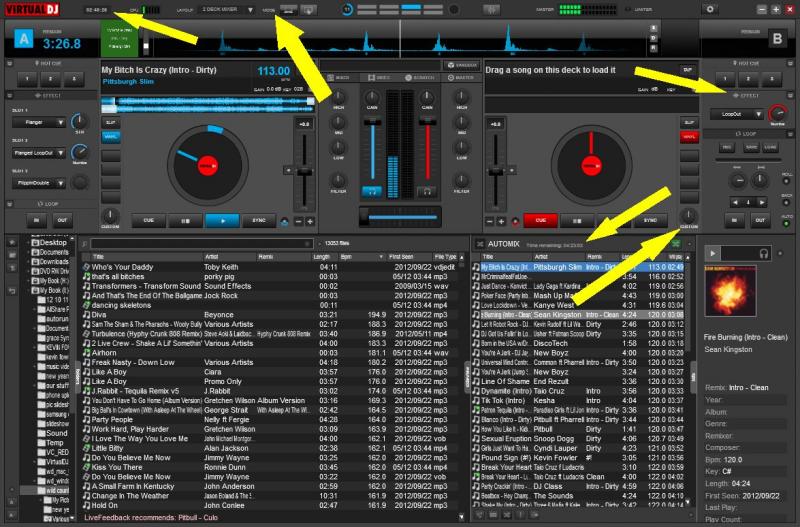
- Values of gain and key are not readable, because they are to small
- Labels of knobs are hard to read, size of font is okay, but the font itself is a bad choice (sorry guys ;-))
Regards, Christian
- Values of gain and key are not readable, because they are to small
- Labels of knobs are hard to read, size of font is okay, but the font itself is a bad choice (sorry guys ;-))
Regards, Christian
Posted Wed 14 May 14 @ 12:04 pm
cgarling
Additionally two little wishes for the wave forms located at the decks (no priority):
- Minute markers
- Elapsed time at the position of the mouse cursor (only on mouse over)
This would be great thing to have a quick overview about how long for example an intro or outro will be.
Thanks, Christian
- Minute markers
- Elapsed time at the position of the mouse cursor (only on mouse over)
This would be great thing to have a quick overview about how long for example an intro or outro will be.
Thanks, Christian
Posted Thu 15 May 14 @ 2:18 am
 wildcountryclub
in keeping with the visual/optical theme wishlist:
this is on a 23 inch monitor (22" viewable)
and resized to 1175 x 774
it was just an approximation of a widescreen drag-resize and the way some of the labels in the bars resized they were difficult to read on screen. I wear glasses now and if I had them off they would have been too small and fuzzy to read at all. if I didn't already know what it said I would have issues reading it.
not sure what a fix would be other than to make the real estate they're on have a larger parameter to be on or resize to fit location they're on
Posted Thu 15 May 14 @ 3:09 am
 A Man and His Music
I agree, I have a 23 in monitor, and the gain and key values are unrealistic. The gain is not that important to me, but the key is.
Posted Thu 15 May 14 @ 3:22 am
cgarling
Also the scrolled text in the browser is not good to read, this should be optional. Thanks.
Posted Thu 15 May 14 @ 3:37 am
 PachN
PachN
It is optional.
Search for "browsertextfit" and set it to "fixed".
Search for "browsertextfit" and set it to "fixed".
Posted Thu 15 May 14 @ 4:28 am
 RobRoy
hihi.....
Posted Thu 15 May 14 @ 4:53 am
 groovindj
wildcountryclub wrote :
this is on a 23 inch monitor (22" viewable)
this is on a 23 inch monitor (22" viewable)
If you think that's bad, you should (try to) see it on a netbook screen!
I agree, the clarity of certain elements (even on HD screens) is poor, and when squashed down to laptop/netbook size - because all VDJ 8 skins are 1920x1080 - some of the visuals are completely unreadable.
The little vertical tabs which divide the browser are tiny blurs on small screens. Hard to see and impossible to read.
OTOH run an old skin (one that's made for the screen res) and those tabs are fine. The solution seems logical to me. :-)
Posted Thu 15 May 14 @ 5:03 am
wildcountryclub
for me its less a browser text size issue as the actual text labels for certain functions.
that "Total Time: " next to the automix is not exactly easy to read
that "Total Time: " next to the automix is not exactly easy to read
Posted Thu 15 May 14 @ 5:04 am
groovindj
You can change some of it from within the skin XML (for example I just shortened the "master vol" text to "master" because it was rather long for the width).
Posted Thu 15 May 14 @ 5:15 am
 djsonance
I also think there should be an option to show both "time remain" and "time elapsed" simultaneously in 2 deck mode.
Posted Thu 15 May 14 @ 5:38 am
cgarlingdjsonance wrote :
I also think there should be an option to show both "time remain" and "time elapsed" simultaneously in 2 deck mode.
Yes, I am missing that too
Posted Thu 15 May 14 @ 5:56 am
The Clock display is ridiculously small , when you change over to the VDJ 7 skin and compare the difference its incredible. I use a 17" screen and its impossible to see , god help anyone on a smaller display. Other than and one or two issues with small size fonts being used iin other parts of the interface i love everything else. Quite puzzled that people have tested it before the pre release and nobody raised the issue internally.
Posted Thu 15 May 14 @ 6:04 am
groovindj
They must all be using giant screens!
I did manage to make the clock bigger by editing in the skin XML, but it's not a pleasant experience. It would be better to have a "clock size adjustment" similar to the browser font size one - or a choice of clock styles/positions (analog clock?).
I did manage to make the clock bigger by editing in the skin XML, but it's not a pleasant experience. It would be better to have a "clock size adjustment" similar to the browser font size one - or a choice of clock styles/positions (analog clock?).
Posted Thu 15 May 14 @ 6:11 am
cgarling
So we all agree, that some texts are too small. I think there is no need to repeat this issue again in this thread. Hopefully a developer will see this and react.
Regards, Christian
Regards, Christian
Posted Thu 15 May 14 @ 6:12 am